Time series
This section describes various approaches to visualize long-term trends and patterns in air monitoring data.
Hour of the day
Looking for the impact of a specific activity?
The R script below shows the concentration distribution for each hour of the day.
library(ggridges)

# Sample data
df <- tibble(time = seq(ymd_hm("2017-06-01 12:00"), ymd_hm("2018-02-01 12:00"), by = "hour"),
             obs  = rnorm(length(time), 55, 12)) %>%
      mutate(n    = 1:n(),
             hour = hour(time) %>% as.factor,
             obs = ifelse(hour %in% c(16:18), obs+29, obs))


ggplot(df, aes(obs, y = hour)) +
  geom_density_ridges(aes(fill=obs))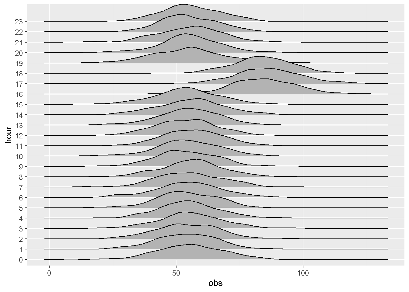
# Add color gradient + title
ggplot(df, aes(obs, y = hour, fill = stat(x))) +
  geom_density_ridges_gradient(scale = 2) +
  scale_fill_viridis_c() +
  labs(title    = "Ozone concentration by hour",
       subtitle = "Evening rush hour?")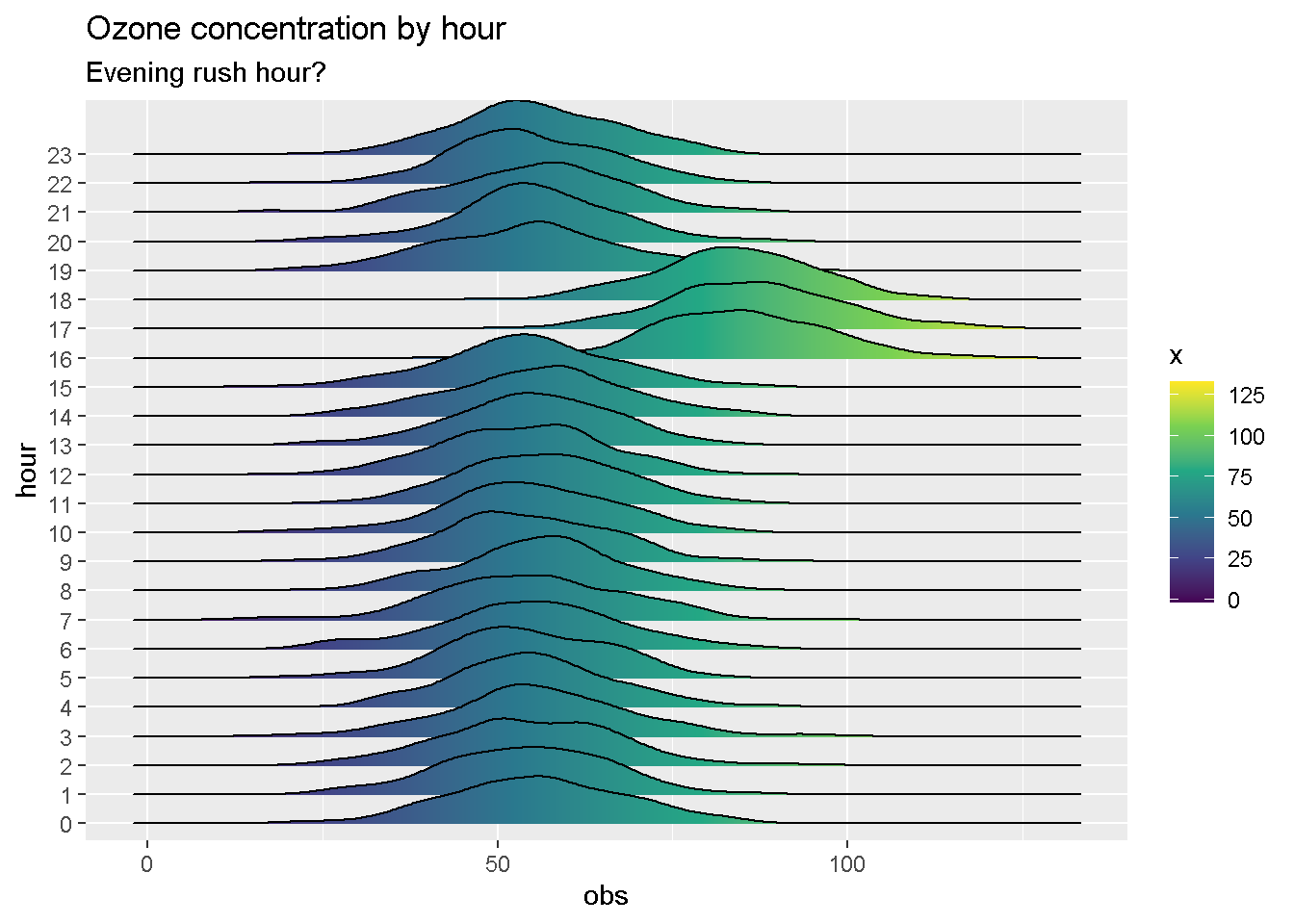
Day of the week
Do high traffic days show up on your air monitor?
The R script below shows air concentrations by day of the week.
# Generate sample data
df <- tibble(time = seq(as.Date("2017-04-01"), as.Date("2018-02-01"), 1),
             obs  = rnorm(length(time), 55, 12)) %>%
       mutate(n       = 1:n(),
              weekday = wday(time, label = T))

df <- df %>%
      rowwise() %>%
      mutate(obs = mean(df$obs[max(0, n - 5):(n + 3)], na.rm = T),
             obs = ifelse(weekday %in% c("Thu", "Fri"), obs+3, obs))

# Create a boxplot, grouped by weekday
ggplot(df, aes(weekday, obs)) +
  geom_boxplot(aes(fill = weekday %in% c("Thu", "Fri")), show.legend = F) +
  labs(title = "Ozone by day of the week")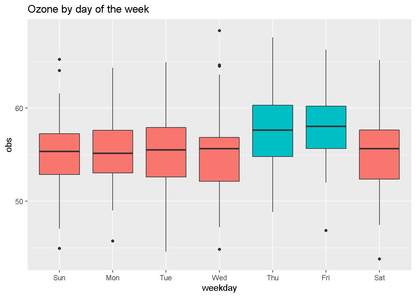
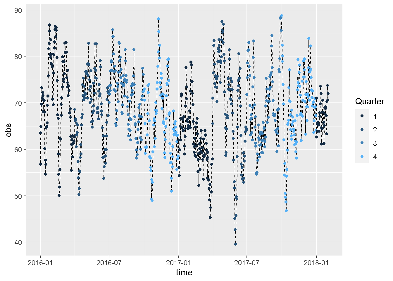
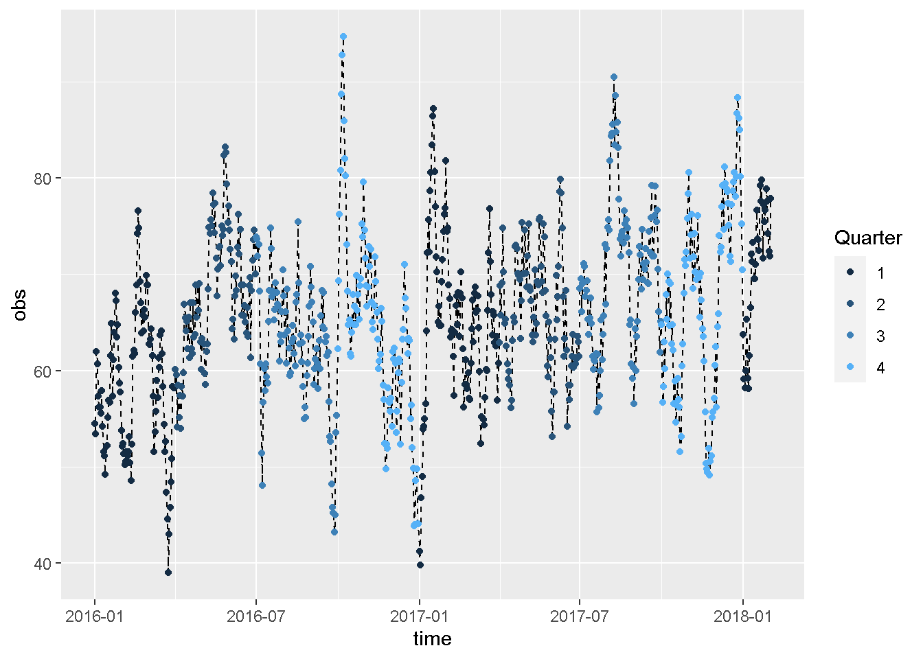
Seasonality
The R script below shows a time series chart that is color coded by the quarter of the year.
library(tidyverse)
library(lubridate)

# Sample data
df <- tibble(time = seq(as.Date("2016-01-01"), as.Date("2018-02-01"), 1),
                 obs  = sample(25:110, 763, replace = T)) %>%
       mutate(n       = 1:n(),
              quarter = quarter(time))

 df <- df %>%
         rowwise() %>%
         mutate(obs = mean(df$obs[max(0, n - 5):(n + 3)], na.rm = T))

# Dotted line plot
ggplot(df, aes(time, obs)) +
  geom_line(linetype = "dashed") +
  geom_point(aes(color = quarter)) +
  guides(color = guide_legend(title = "Quarter"))