R Camp | day 3
Good morning, Adventurers!

This tutorial is online at
Please remote connect to your desktop computer
- Open the Start menu *Click the Window’s logo on the bottom left of the screen
- Select
Remote Desktop Connection - Enter
w7-your7digit# - Press Connect
Open your RStudio project
- Open your project folder from last week.
- Double click the .Rproj file to open RStudio.
- Ready yourself for an adventure.
CAMP schedule
- Finish plotting
- Line charts.
- Add titles and axis labels.
- Boxplots.
- Log transform your chart axis.
- Bar charts.
- Save plots in different formats:
ggsave()
- Tidy your data with tidyr
- Replace missing values.
- Flip your table from wide to tall format.
- Join tables together.
- Connect to data sources
- Excel
- SQL databases (e.g. TEMPO / delta / CEDR / EQUIS)
- GIS Shapefiles
- Web data (URL or FTP site)
- Access
- Tableau
Day 2 review
Reminder: Add your packages to the top of each new script.
library(readr)
library(dplyr)
library(ggplot2)

# Your code starts here.
1. Table summary functions
summary()names()nrow()ncol()glimpse()
2. Completed data transformation
- Save your data with
write_csv(). - Add a column with
mutate(). - Summarize your data with
summarize()(or summarise if you’re from New Zealand).mean()median()max()min()nth()sd()n()quantile(data, 0.05)
- Add
na.rm = Tto ignore missing values:mean(data, na.rm = T).
- Summarize by different categories in a group with
group_by(). - Connect multiple functions with the pipe operator
%>%.
3. Made awesome charts
ggplot()from the ggplot2 package.- Different geometries:
geom_point()geom_smooth()geom_histogram()
- Modified histogram bar position:
position = "dodge". - Set plot colors to vary based on a column in the data.
geom_point(aes(color = content_rating))
Plotting with ggplot2 …continued
Let’s load the IMDB movie data again.
Surprise! The data is now in an Excel file.
Excel files

Excel files are complicated. Let’s install the readxl package!
install.packages("readxl")Now we can use the read_excel() function to load data from any tab we want in an Excel file.
As an example, download the movie data as an XLSX file from HERE and save it to your data folder.
Now you can use read_excel() to load the data into R.
library(readxl)
library(dplyr)
library(ggplot2)

movie_file <- "data/movies/IMDB movie data.xlsx"

# Read Excel file
movies <- read_excel(movie_file)
Show the sheet names in the Excel file.
# Show sheet names in file
excel_sheets(movie_file)
## [1] "intro" "use_this" "new_sheet"
## [4] "dont_use_this (2)"# The default is the first tab/sheet.
# Pick the second sheet using `sheet = 2`
movies <- read_excel(movie_file, sheet = 2)
# Or, pick the "use_this" tab
movies <- read_excel(movie_file, sheet = "use_this")
# Column names start on the 3rd row
# Skip the top 2 rows of random info
movies <- read_excel(movie_file, sheet = "use_this", skip = 2)
# Rename the 'color' column
movies <- rename(movies, movie_color = color)
# Check column types
glimpse(movies)## Observations: 4,092
## Variables: 29
## $ movie_color <chr> "Color", "Color", "Color", "Color", ...
## $ director_name <chr> "James Cameron", "Gore Verbinski", "...
## $ num_critic_for_reviews <dbl> 723, 302, 602, 813, 462, 392, 324, 6...
## $ duration <dbl> 178, 169, 148, 164, 132, 156, 100, 1...
## $ director_facebook_likes <dbl> 0, 563, 0, 22000, 475, 0, 15, 0, 282...
## $ actor_3_facebook_likes <dbl> 855, 1000, 161, 23000, 530, 4000, 28...
## $ actor_2_name <chr> "Joel David Moore", "Orlando Bloom",...
## $ actor_1_facebook_likes <dbl> 1000, 40000, 11000, 27000, 640, 2400...
## $ gross <dbl> 760505847, 309404152, 200074175, 448...
## $ genres <chr> "Action|Adventure|Fantasy|Sci-Fi", "...
## $ actor_1_name <chr> "CCH Pounder", "Johnny Depp", "Chris...
## $ movie_title <chr> "Avatar", "Pirates of the Caribbean:...
## $ num_voted_users <dbl> 886204, 471220, 275868, 1144337, 212...
## $ cast_total_facebook_likes <dbl> 4834, 48350, 11700, 106759, 1873, 46...
## $ actor_3_name <chr> "Wes Studi", "Jack Davenport", "Step...
## $ facenumber_in_poster <chr> "0", "0", "1", "0", "1", "0", "1", "...
## $ plot_keywords <chr> "avatar|future|marine|native|paraple...
## $ movie_imdb_link <chr> "http://www.imdb.com/title/tt0499549...
## $ num_user_for_reviews <dbl> 3054, 1238, 994, 2701, 738, 1902, 38...
## $ language <chr> "English", "English", "English", "En...
## $ country <chr> "USA", "USA", "UK", "USA", "USA", "U...
## $ content_rating <chr> "PG-13", "PG-13", "PG-13", "PG-13", ...
## $ budget <chr> "237000000", "300000000", "245000000...
## $ title_year <dbl> 2009, 2007, 2015, 2012, 2012, 2007, ...
## $ actor_2_facebook_likes <dbl> 936, 5000, 393, 23000, 632, 11000, 5...
## $ imdb_score <dbl> 7.9, 7.1, 6.8, 8.5, 6.6, 6.2, 7.8, 7...
## $ aspect_ratio <chr> "1.78", "2.35", "2.35", "2.35", "2.3...
## $ movie_facebook_likes <dbl> 33000, 0, 85000, 164000, 24000, 0, 2...
## $ gross_mil <dbl> 760.50585, 309.40415, 200.07417, 448...# Convert character numbers to numeric()
movies <- mutate(movies,
budget = as.numeric(budget),
aspect_ratio = as.numeric(aspect_ratio))Line charts
Now let’s look at the total gross of movies over time in millions of dollars.
gross_by_year <- movies %>%
                         group_by(title_year) %>%
                         summarize(total_gross = sum(gross_mil, na.rm = T)) %>%
                         ungroup()

ggplot(gross_by_year, aes(x = title_year, y = total_gross)) +
geom_line() 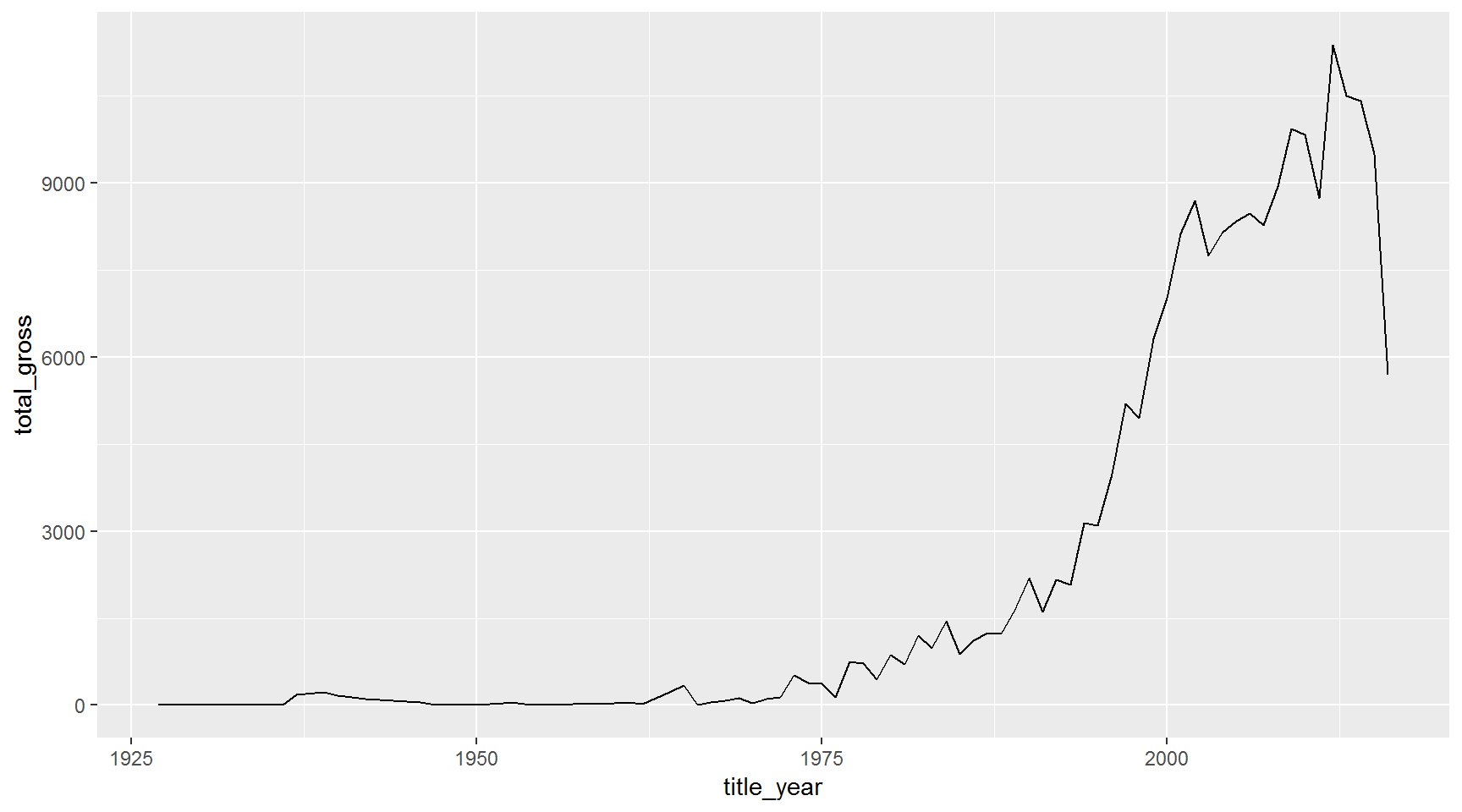
Let’s use a different color line for each content_rating
gross_by_year <- movies %>%
                   group_by(title_year, content_rating) %>%
                   summarize(total_gross = sum(gross_mil, na.rm = T)) %>%
                   ungroup()

ggplot(gross_by_year, aes(x = title_year, y = total_gross)) +
geom_line(aes(color = content_rating)) 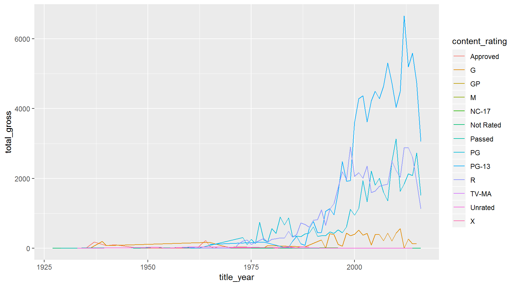
This would be even better with a title and better axis labels. Let’s add some using the labs() function.
Title and axis labels
ggplot(gross_by_year, aes(x = title_year, y = total_gross, color = content_rating)) +
  geom_line() +
  labs(title = "Is the movie industry making more money now?",
       x     = "Year",
       y     = "Gross in millions of U.S. $$$$")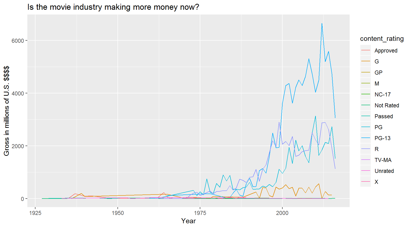
Better! But it would look even better with a subtitle and a caption.
ggplot(gross_by_year, aes(x = title_year, y = total_gross, color = content_rating)) +
  geom_line() +
  labs(title = "The movie industry is making more money over time",
       subtitle = "What happened in 2012? Netflix? YouTube? New books?",
       x        = "Year",
       y        = "Gross in millions of U.S. $$$$",
       caption  = "Awesome chart made by Derek. December 2017.")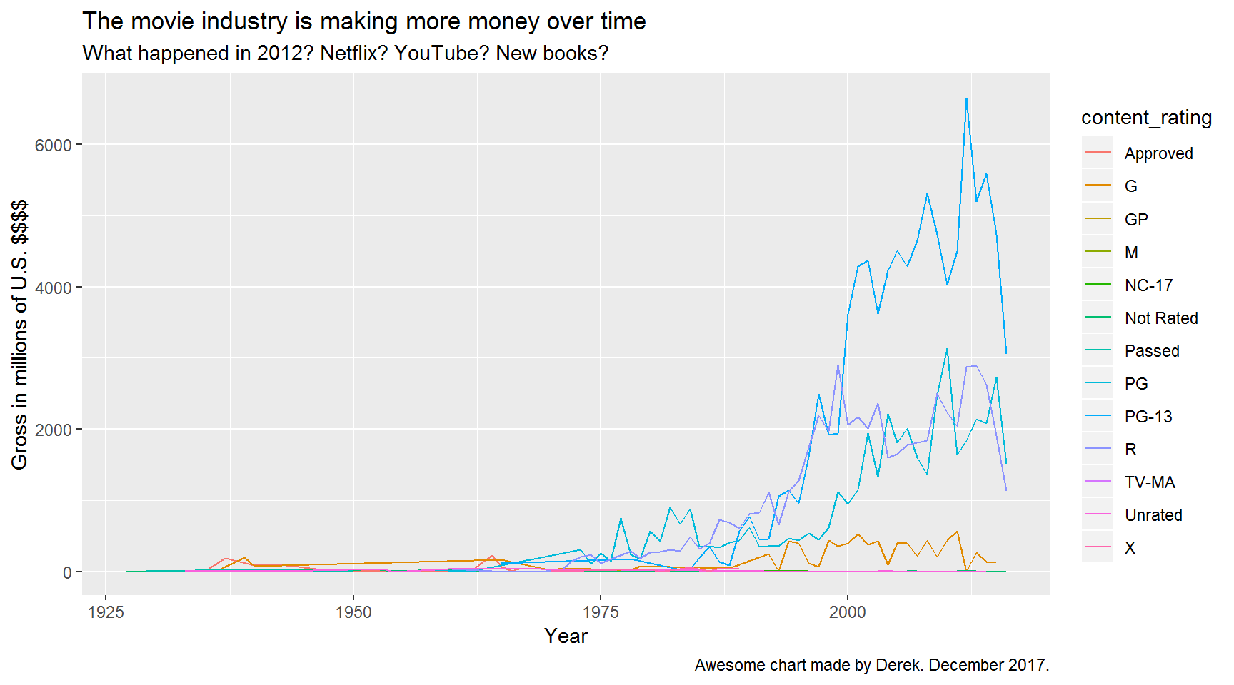
Exercise
Make a line chart showing the total budget of all the movies each year.
Boxplots
Use geom_boxplot() to make a boxplot.
Let’s compare how much money movies made by content rating. Use y = gross_mil for the y-axis.
ggplot(movies, aes(x = content_rating, y = gross_mil)) +
  geom_boxplot()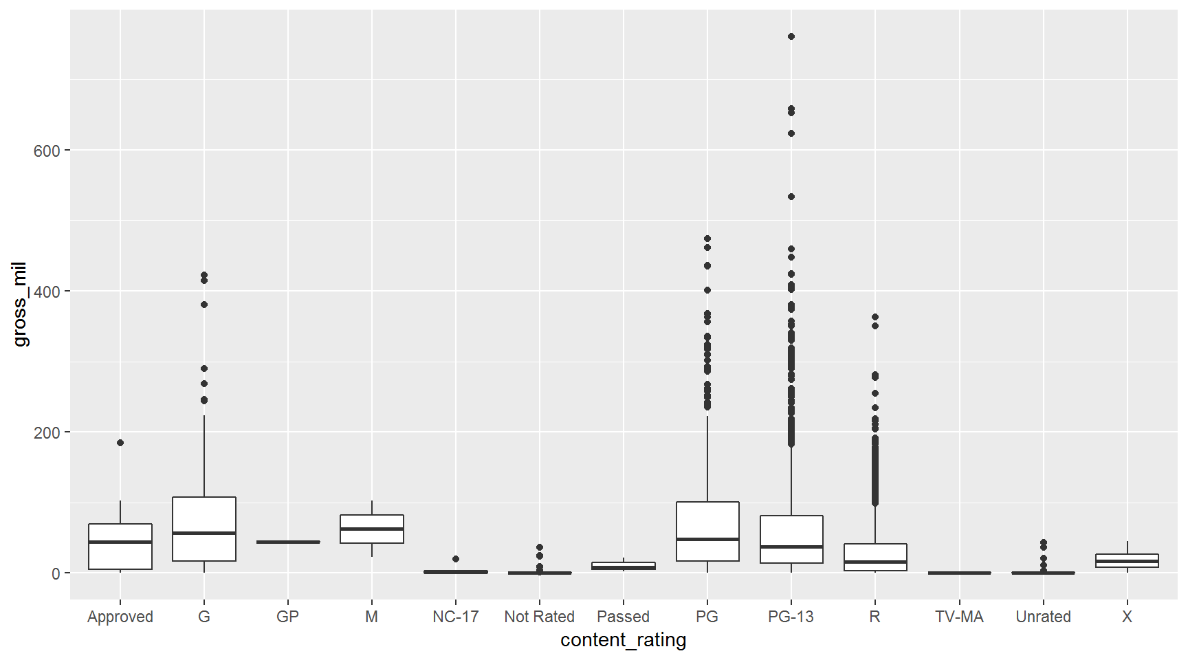
Transform to Log scale.
ggplot(movies, aes(x = content_rating, y = gross_mil)) +
  geom_boxplot() +
  scale_y_log10()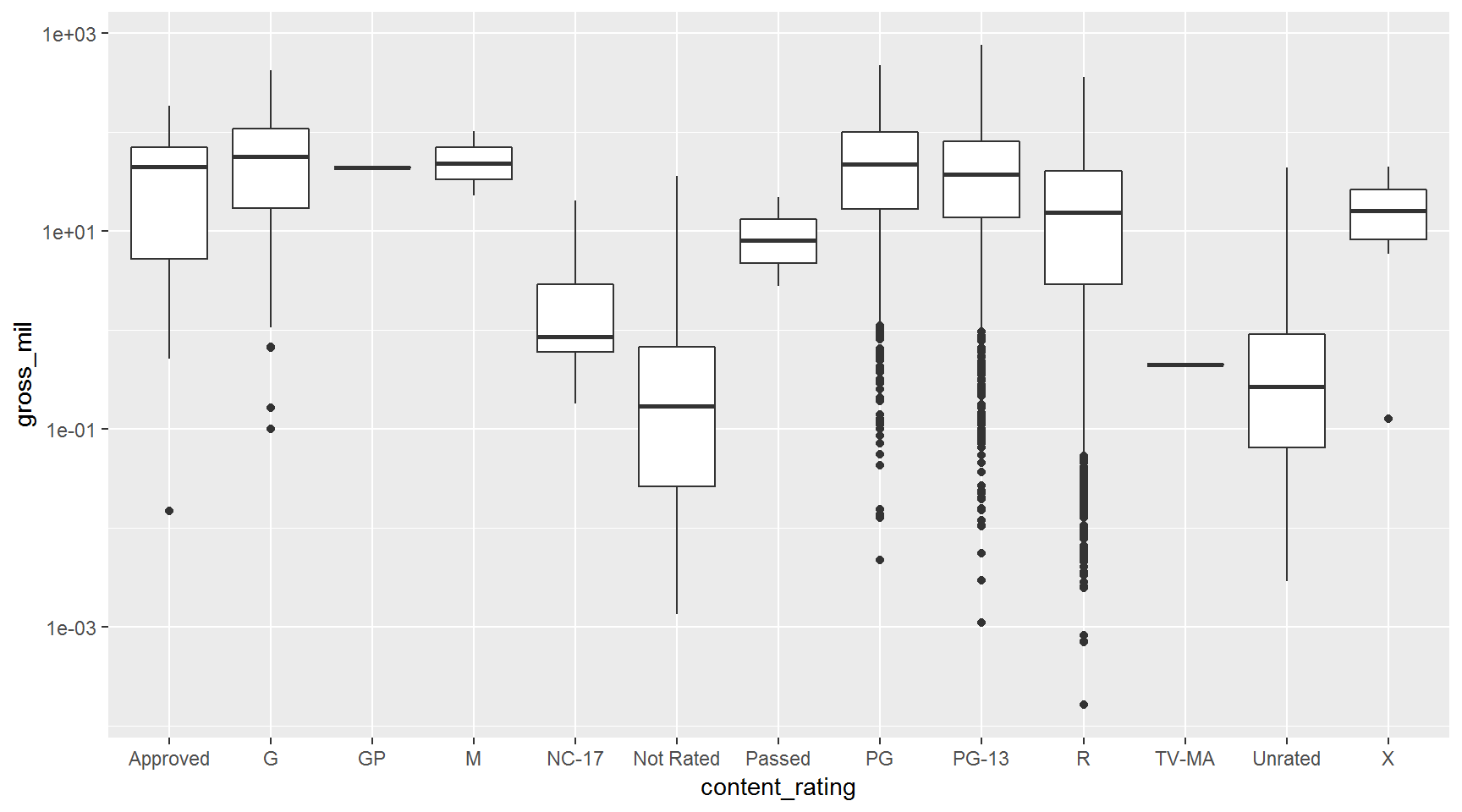
Make the outliers stand out. Rotten tomatoes.
ggplot(movies, aes(x = content_rating, y = gross_mil)) +
  geom_boxplot(outlier.color = "tomato") +
  scale_y_log10()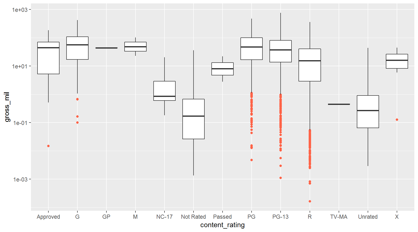
Add another sandwich showing the points on top of the boxplots.
ggplot(movies, aes(x = content_rating, y = gross_mil)) +
  geom_boxplot(outlier.color = "tomato") +
  scale_y_log10() +
  geom_point(alpha = 0.1)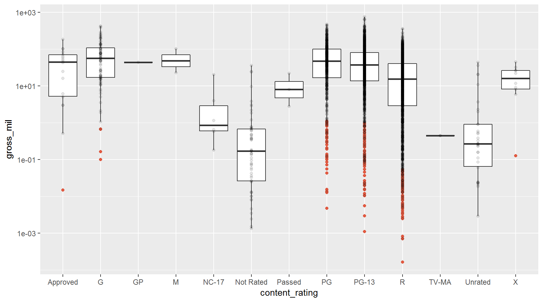
Use jitter() to spread out the points. This makes a snowfall plot.
ggplot(movies, aes(x = content_rating, y = gross_mil)) +
  geom_boxplot(outlier.color = NA) +
  scale_y_log10() +
  geom_jitter(alpha = 0.1)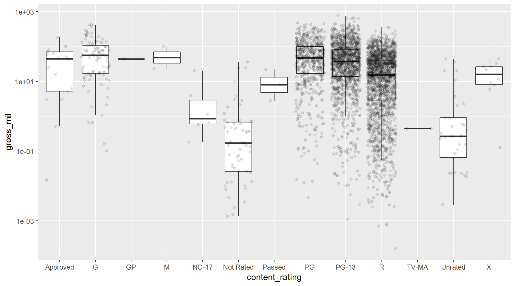
Rearrange the layer order to put the boxplots on top.
ggplot(movies, aes(x = content_rating, y = gross_mil)) +
  scale_y_log10() +
  geom_jitter(alpha = 0.1) +
  geom_boxplot(outlier.color = NA, alpha = 0.8)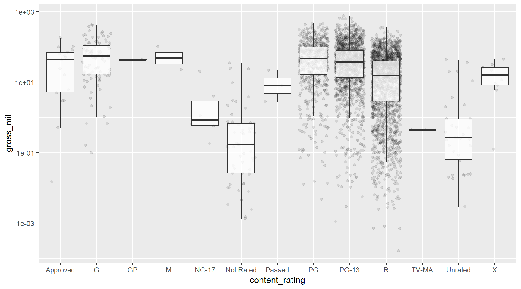
Exercise
Make boxplots comparing the range of gross_mil between movie_color (black and white films vs. color films).
Show solution
ggplot(movies, aes(x = movie_color, y = gross_mil)) +
  scale_y_log10() +
  geom_jitter(alpha = 0.1) +
  geom_boxplot(outlier.color = NA, alpha = 0.8)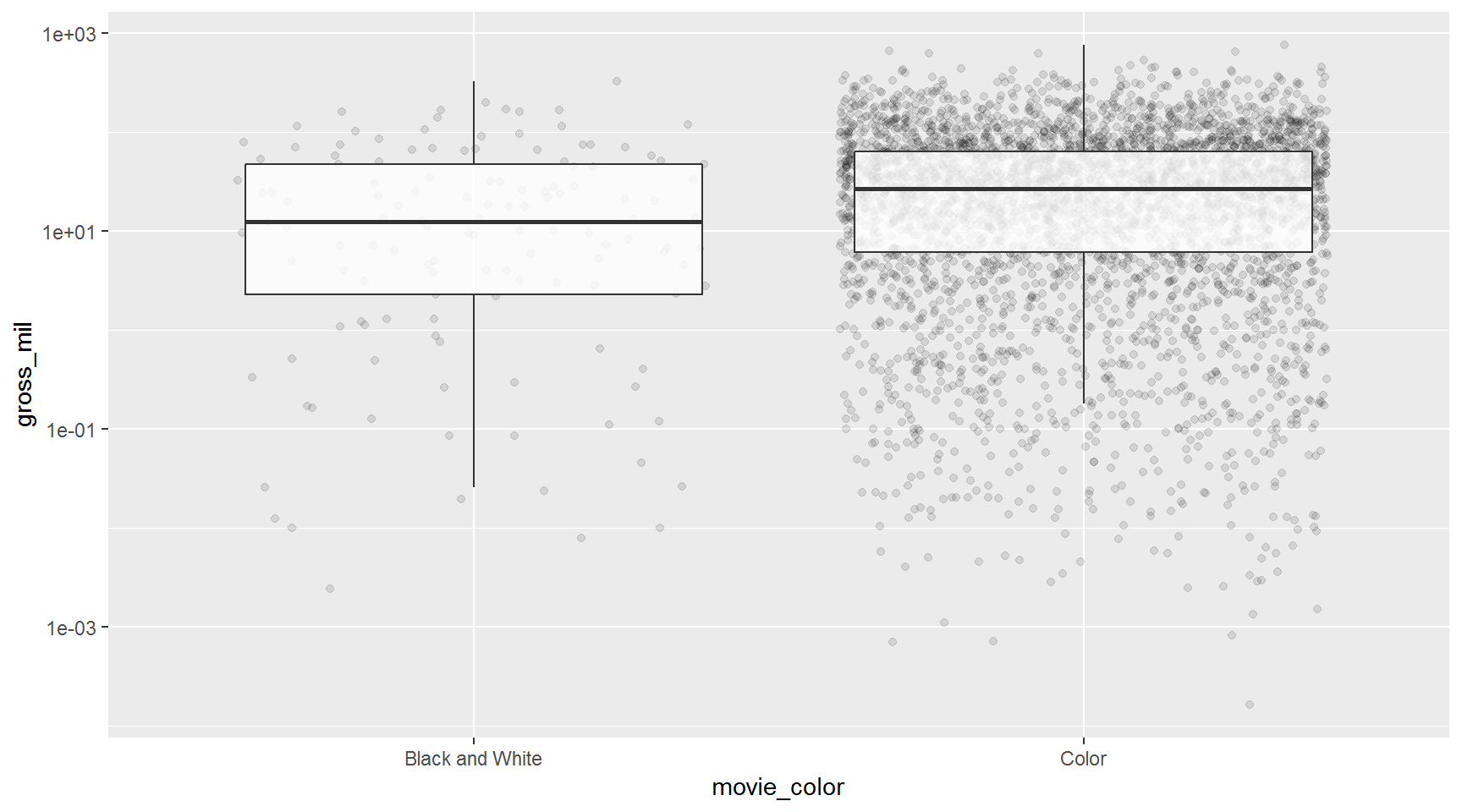
Johnny Depp movies

We received questions about creating a new column with
mutate()based on the values of an existing column.
To learn how to do this, let’s make a boxplot of how much movies make that starred Johnny Depp vs. those that didn’t (big mistake!). First we need to learn about ifelse().
ifelse() makes a comparison and then returns a value depending on the result of the comparison. The comparison below looks to see whether a movie’s #1 actor was Johnny Depp, if it was then ifelse() returns Yes, if not it returns No.
movies <- movies %>%
          mutate(stars_johnny_depp = ifelse(actor_1_name == "Johnny Depp", "Yes", "No"))

ggplot(movies, aes(x = stars_johnny_depp, y = gross_mil)) +
  geom_boxplot() +
  scale_y_log10()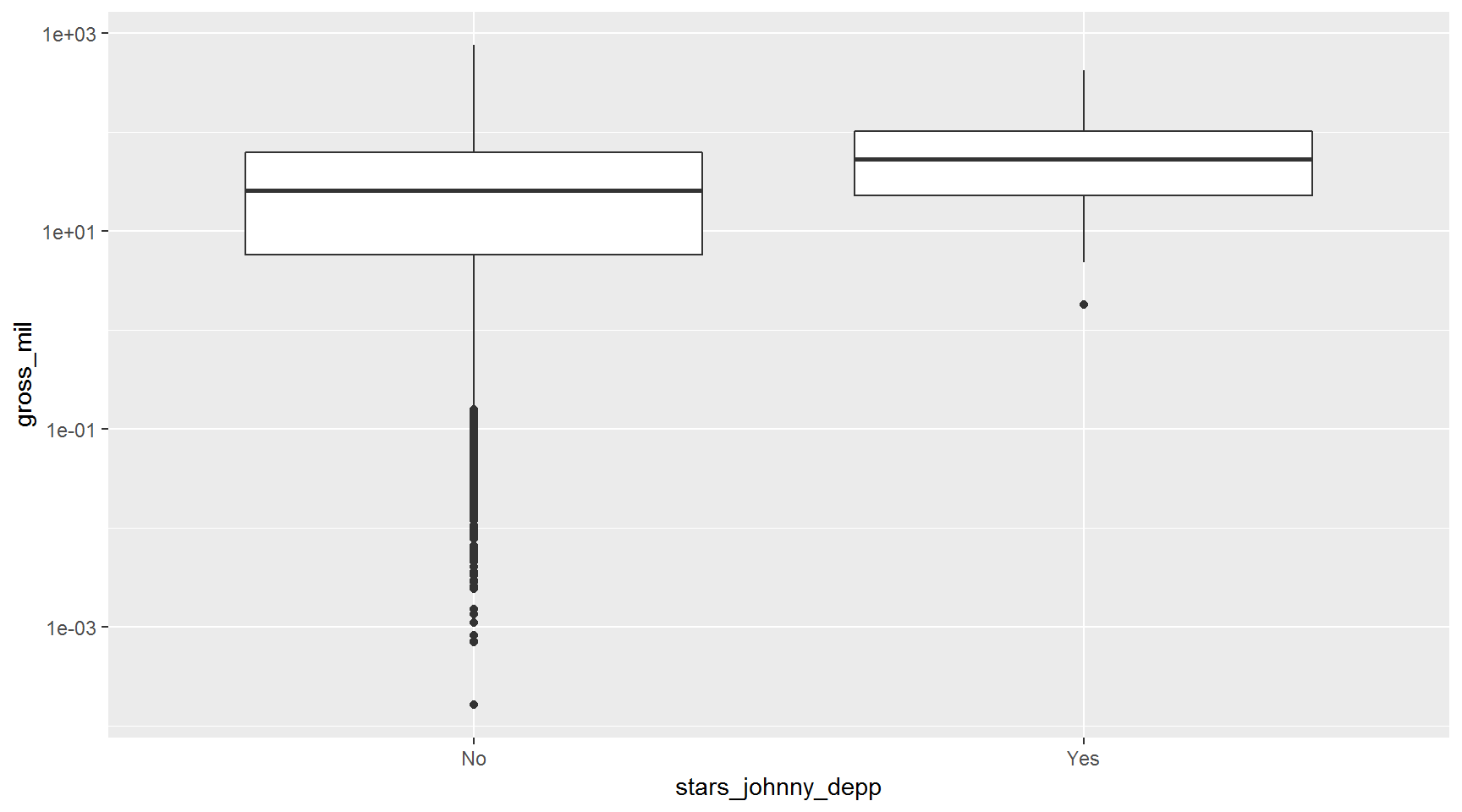
Bar charts
Use a bar chart to compare imdb_score by content_rating
imdb_score_by_content <- movies %>%
                           group_by(content_rating) %>%
                           summarize(mean_score = mean(imdb_score, na.rm = T))

ggplot(imdb_score_by_content, aes(x = content_rating, y = mean_score)) + geom_col() 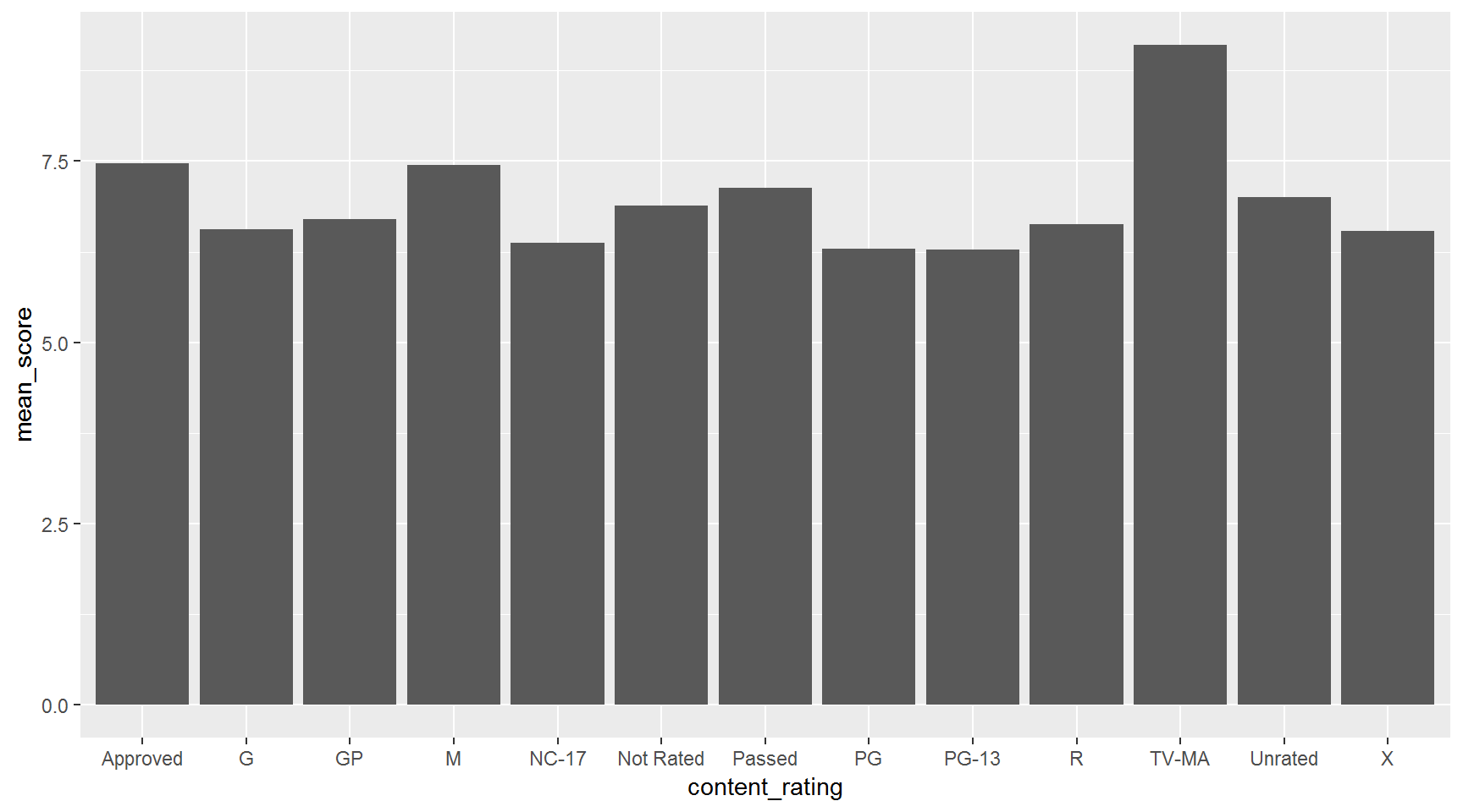
Note: By default geom_bar() simply counts the number of values in each category. If you want to show the height of each bar at a specific value in the data, use geom_bar(stat = "identity"). The function geom_col() is equivalent to geom_bar(stat = "identity").
Labels for each bar
There’s a geom_label we can use to label each column.
ggplot(imdb_score_by_content, aes(x = content_rating, y = mean_score)) +
  geom_col() +
  geom_label(aes(label = mean_score))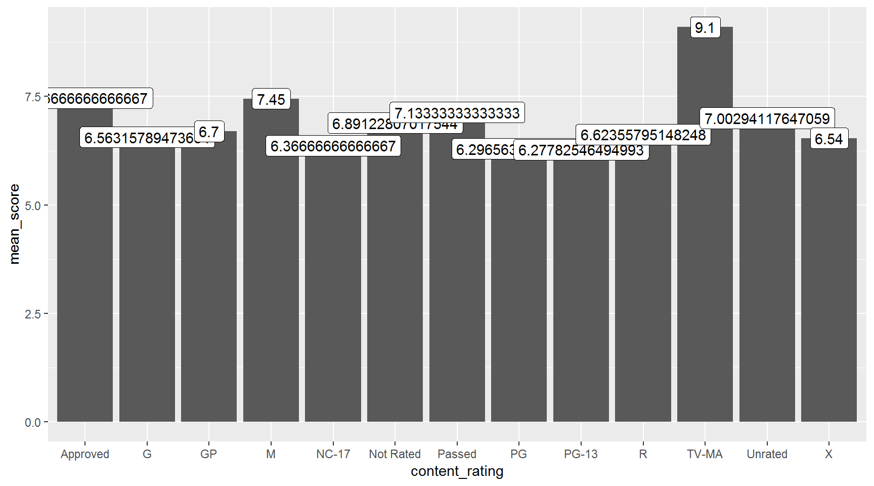
Hint: Update to label = round(mean_score, digits = 1)) to make labels legible.
Exercise (extra credit)
Create a summarized data set and bar chart of the mean budget by content_type.
Show solution
budget_by_content <- movies %>%
                     group_by(content_rating) %>%
                     summarize(mean_budget         = mean(budget, na.rm = T) / 1000000,
                               mean_budget_round   = round(mean_budget, digits = 1))

ggplot(budget_by_content, aes(x = content_rating, y = mean_budget_round)) +
  geom_bar(stat = "identity") +
  geom_label(aes(label = mean_budget_round))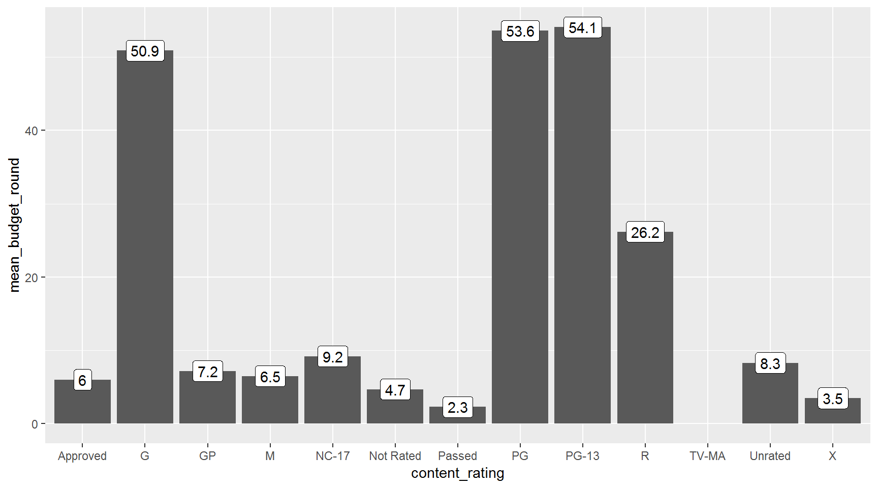
Just for fun…
the BIG profit chart (try after class)
Show BIG profit chart
Add a profit column
movies <- mutate(movies,
                 profit     = gross - budget,
                 profit_mil = profit / 1000000)
Plot the profit of every film
ggplot(movies, aes(x = title_year, y = profit)) + geom_jitter(alpha = 0.5)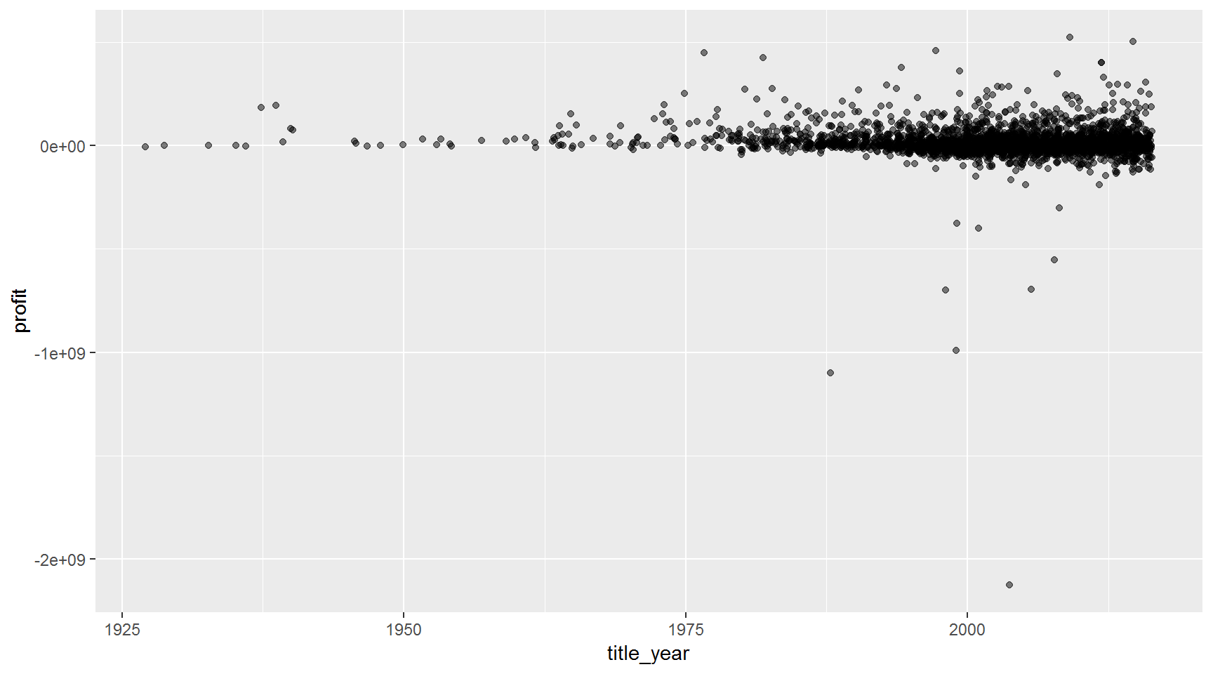
Label the top and bottom 1/2 percentile of movies
ggplot(movies, aes(x = title_year,  y = profit)) +
  geom_jitter(alpha = 0.5) +
  geom_label(aes(x = title_year,
                 y = profit,
                 label = ifelse(profit > quantile(movies$profit, 0.997, na.rm = T) |
                                profit < quantile(movies$profit, 0.003, na.rm = T),
                                movie_title,
                                NA)),
             alpha = 0.85,
             nudge_y = 3) +
  labs(title  = "Which movies made and lost the most $$$ ?",
       y      = "Profit in U.S. dollars",
       x      = "year")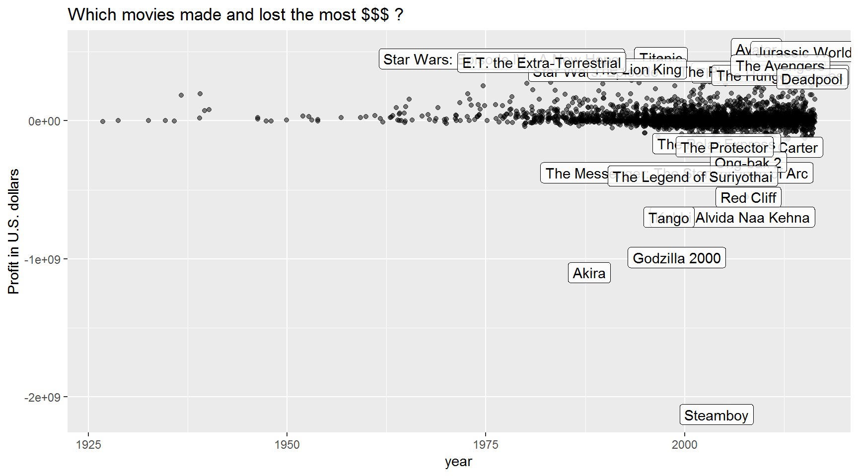
Label them all!
Warning! This adds thousands of labels and may stall your computer for a few minutes. You have been warned.
library(hrbrthemes)  #install.packages(hrbrthemes)
library(scales)      # For the $ dollar_format() labels

ggplot(movies, aes(x = title_year,  y = profit)) +
  geom_label(aes(label = movie_title,
                 fill  = profit > 0),
                 show.legend = F,
                 alpha = 0.9) +
  scale_y_continuous(labels = dollar_format()) +
  labs(title    = "Did your favorite film make or lose $$$ ?",
       subtitle = "Profit of top 5,000 rated films on IMDB",
       y        = "Profit in U.S. dollars",
       x        = "year",
       caption  = "Brought to you by the #R-Cats") +
  theme_ipsum_rc() +
  theme(plot.title = element_text(size = 24)) # Increase title size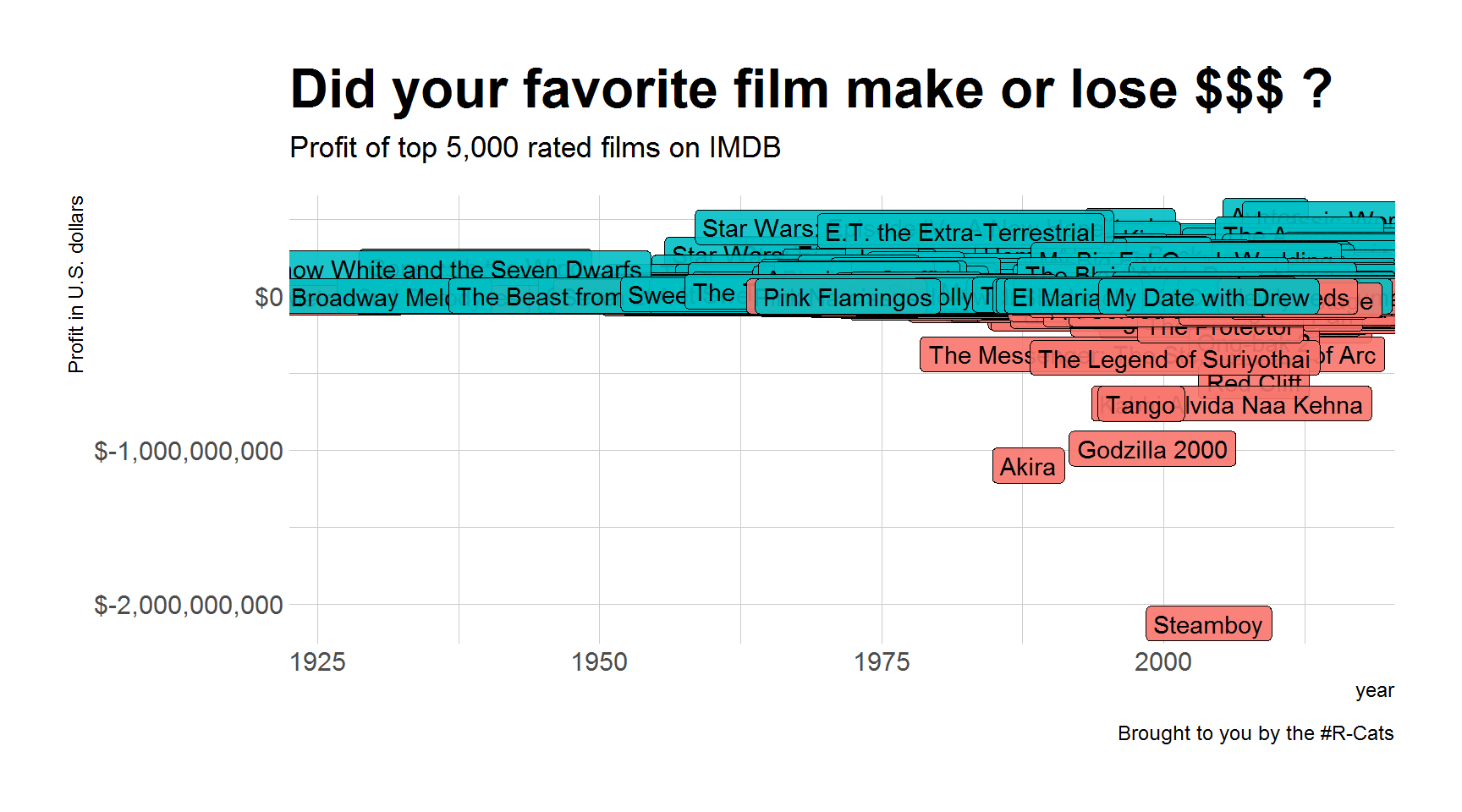
Plot summary
Table of aesthetics.
| aes() | |
|---|---|
x = |
|
y = |
|
alpha = |
|
fill = |
|
color = |
|
size = |
|
linetype = |
Table of geoms.
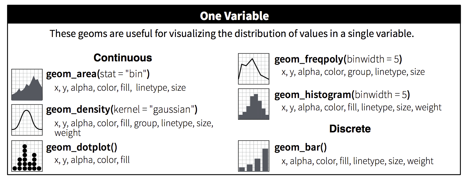
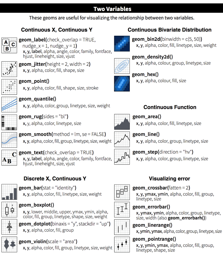
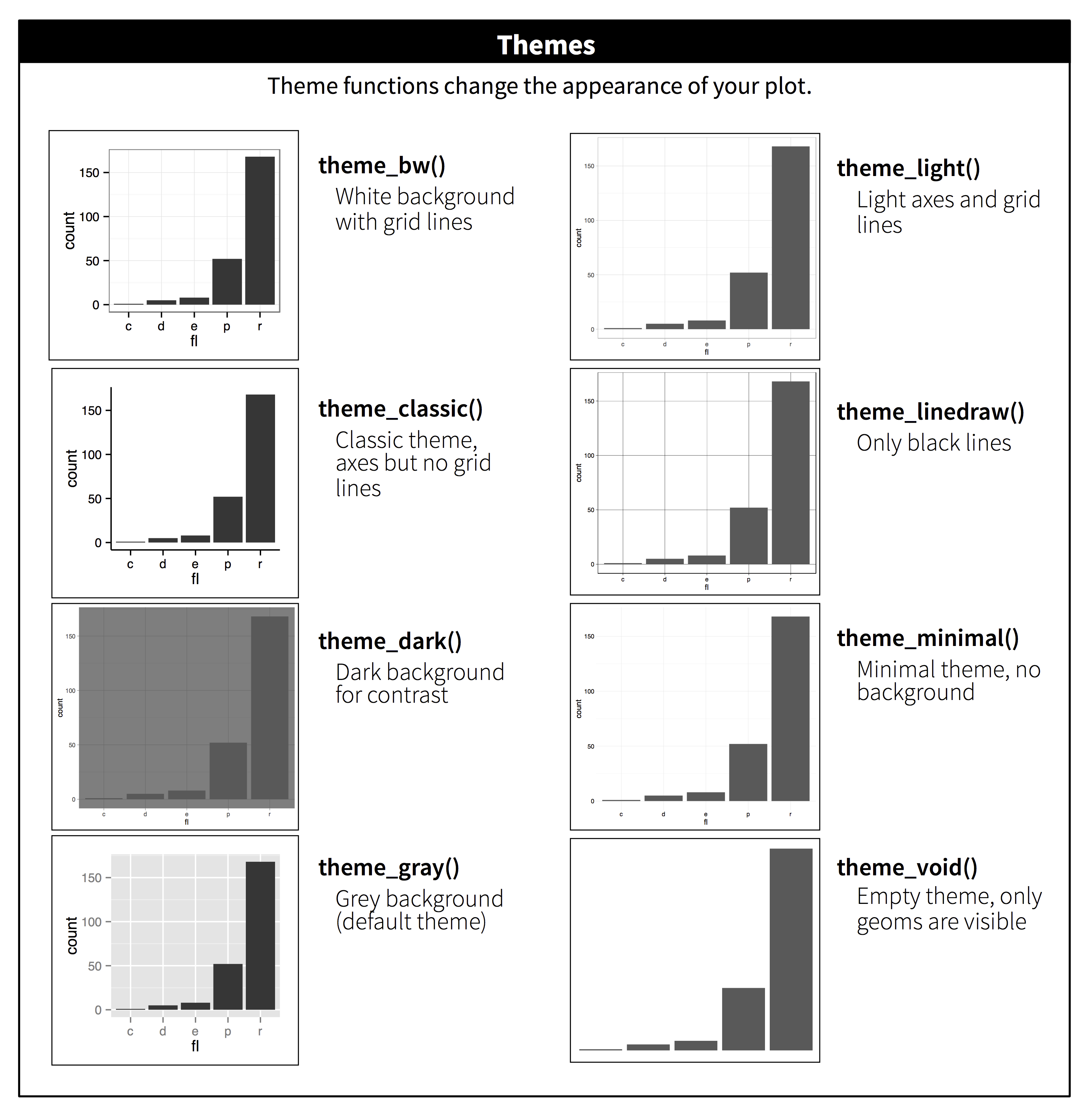
Table of themes.
You can customize the look of your plot by adding a theme() function.
Plotting finale!
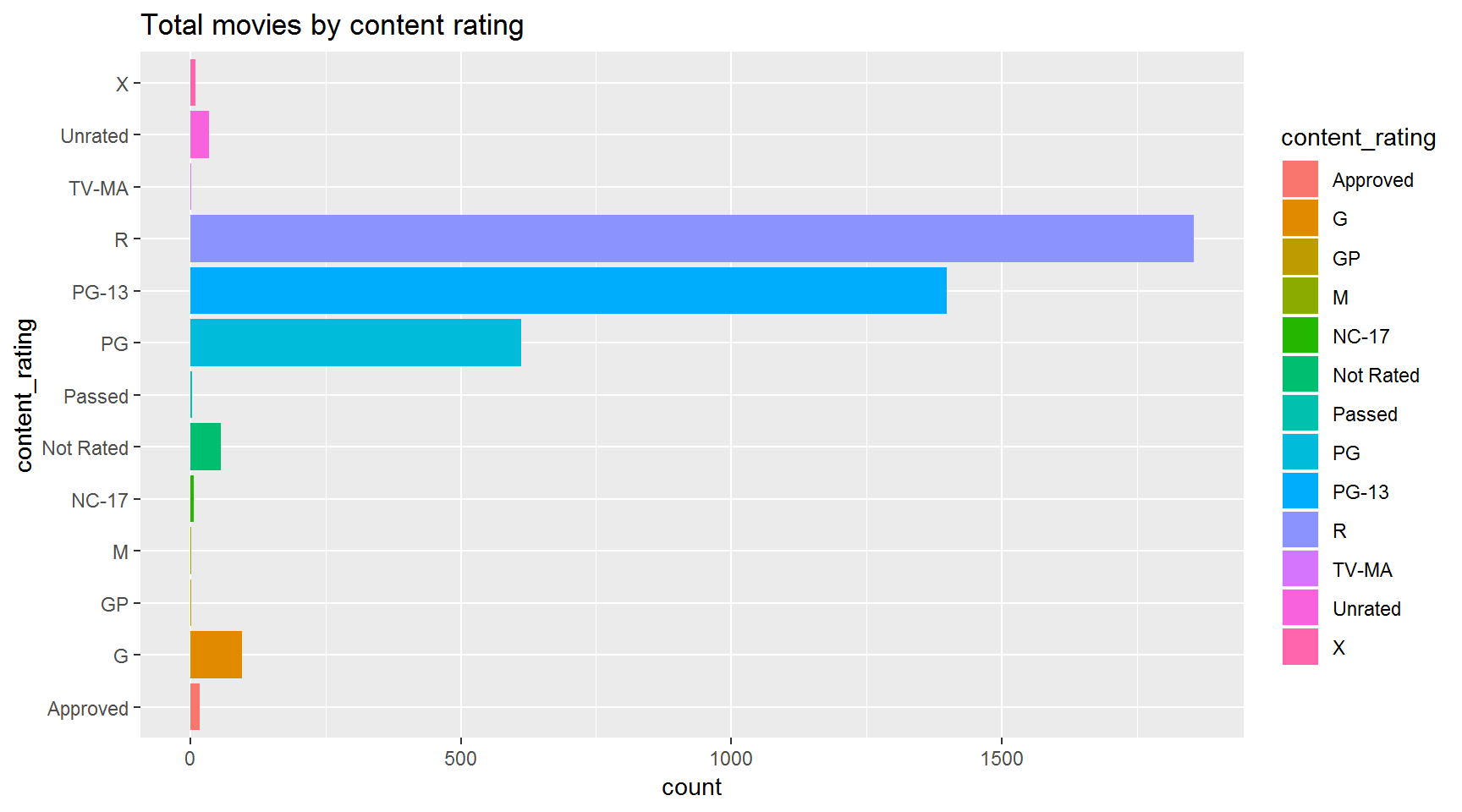
Choose one of the plots below and create it with your neighbor. Compare your code when you’re done.
How many movies were made in each content rating?
Hint: use + coord_flip()
Are the number of movies increasing for G, PG, PG-13 and R rated films?
Hint: Use %in% to match on multiple values when you filter(). 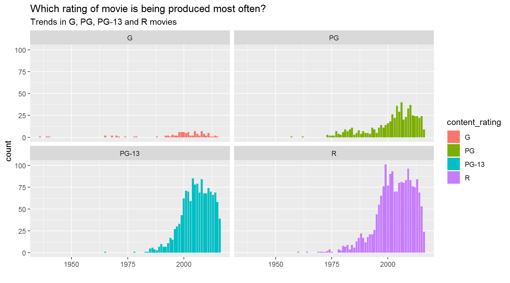
Since 2012, have the total Facebook likes for a movie been associated with the number of cast Facebook likes?
Hint: We made a similar chart in Day 2. 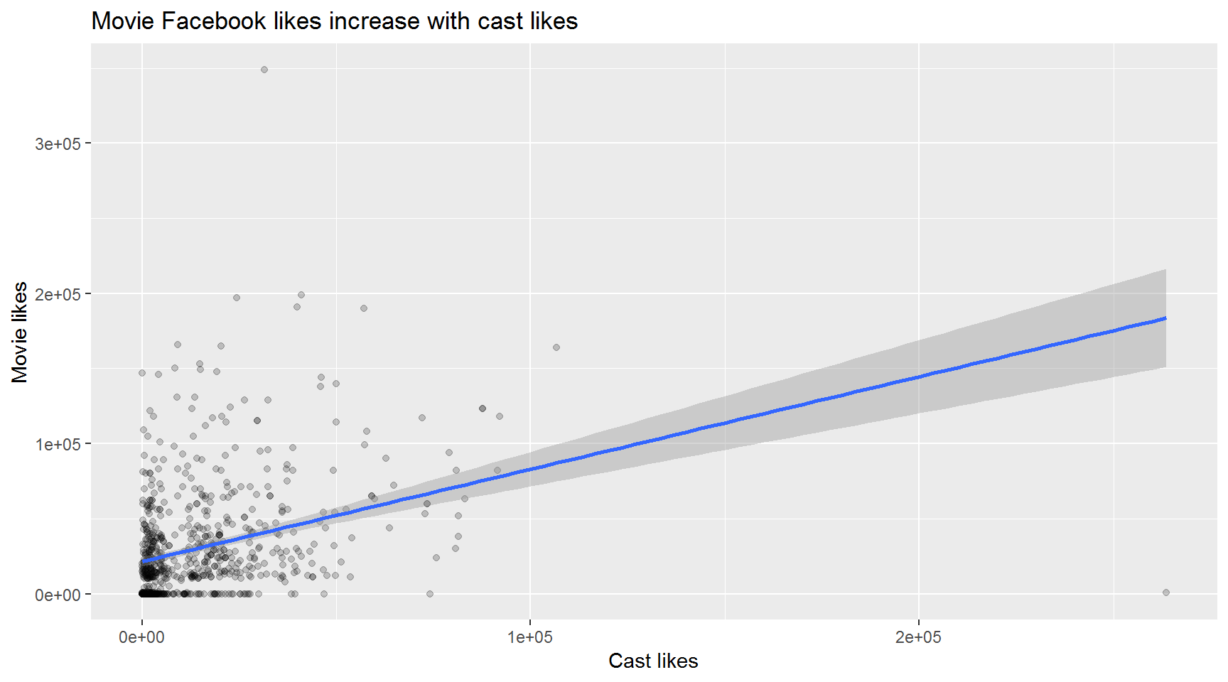
What is the trend in the total gross of G and PG rated films?
Hint: Create a summarized table grouped by title_year and content_rating 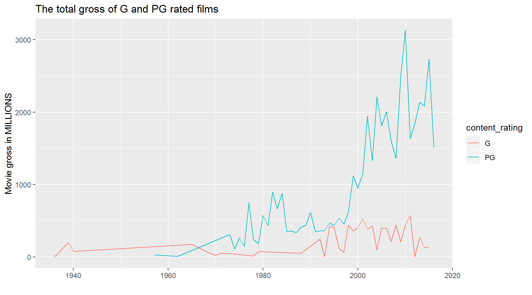
Since 2012, which content rating has had the highest median number of Facebook likes?
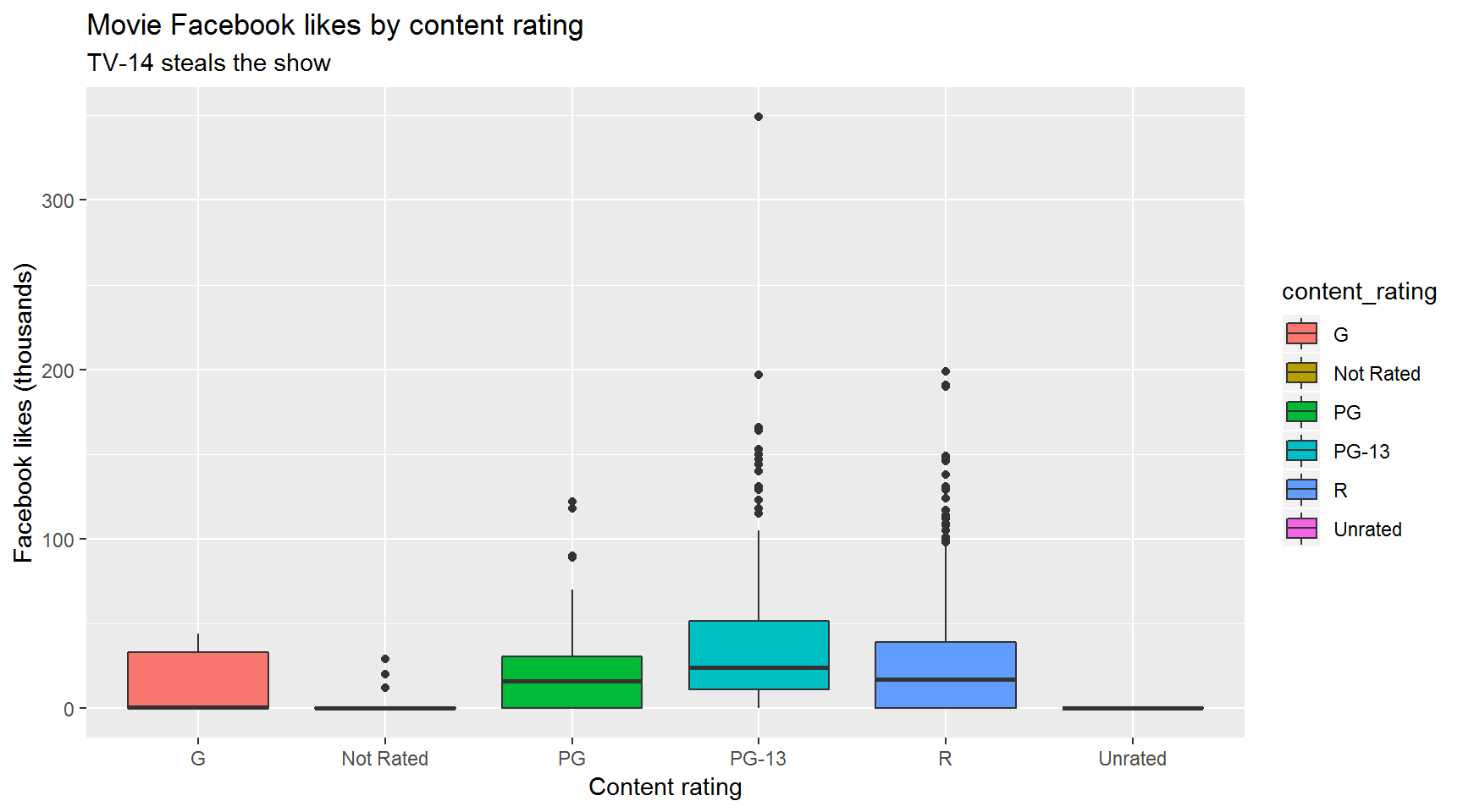
Bar chart version
Hint: Summarize the movies bycontent_rating. 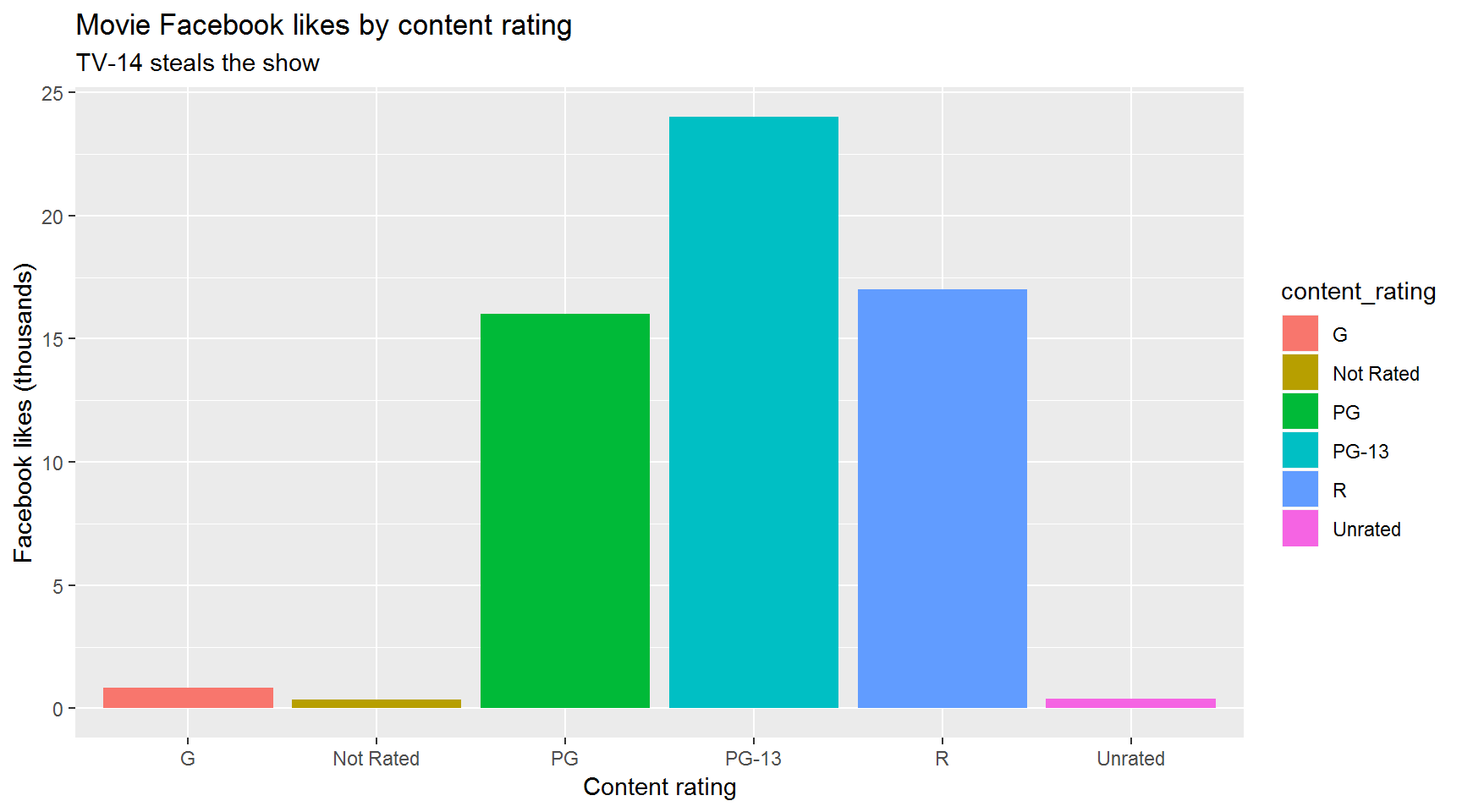
Which type of movie has the shortest running time: G, PG-13, or R?
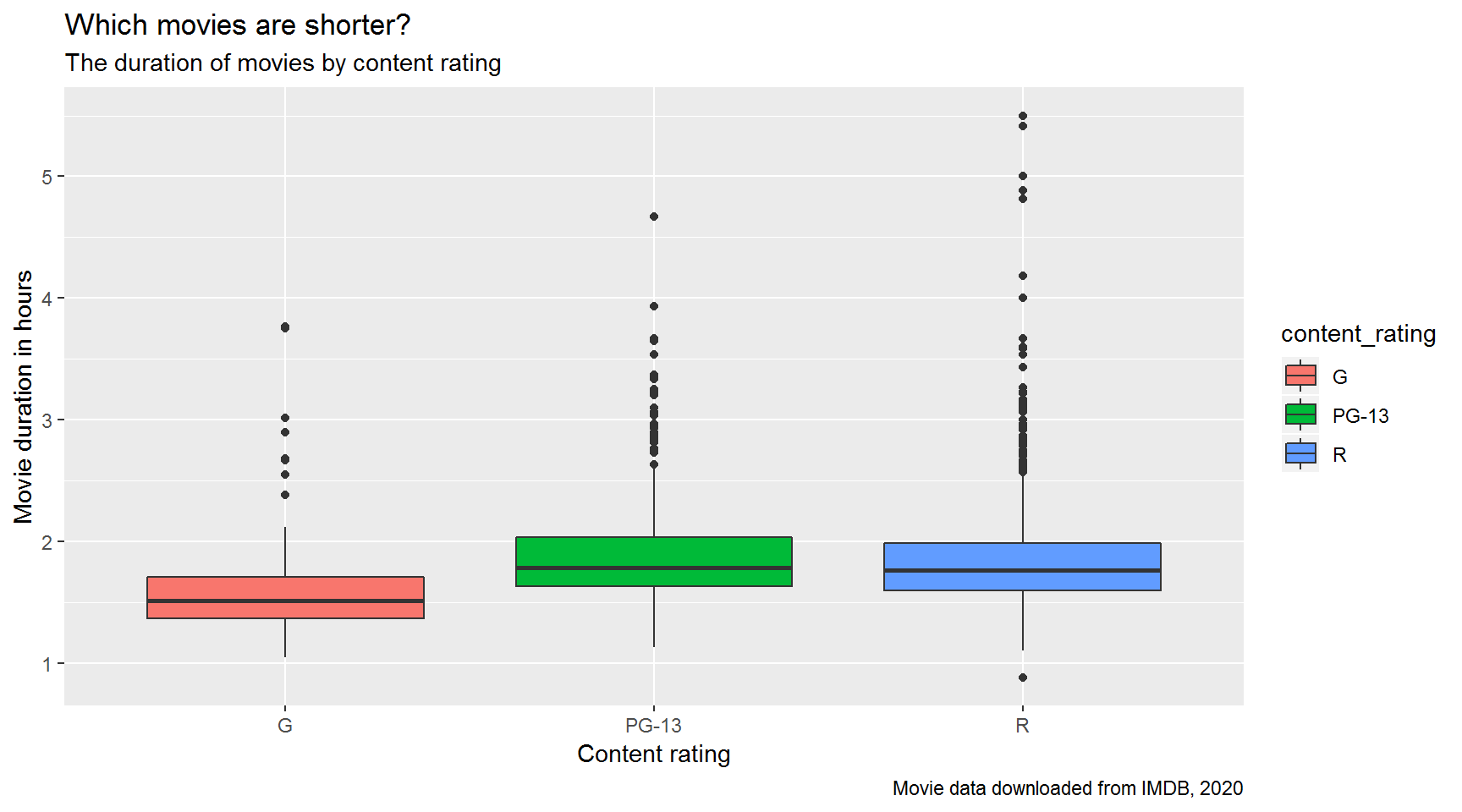
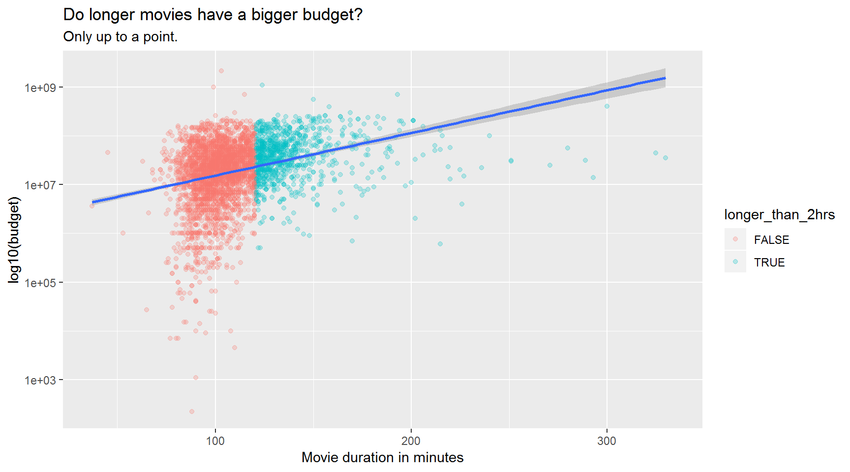
Movie budgets of longer movies.
Hint: Create a new column called longer_than_2hrs and set it equal to duration > 120
Hint 2: Use scale_y_log10()
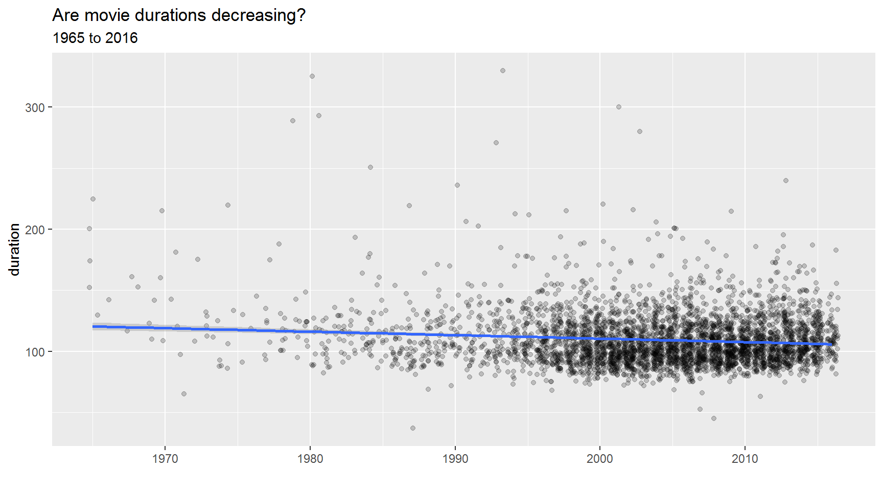
They say attention spans are dwindling. Have movie durations been decreasing since 1965?
Hint: Use geom_jitter()
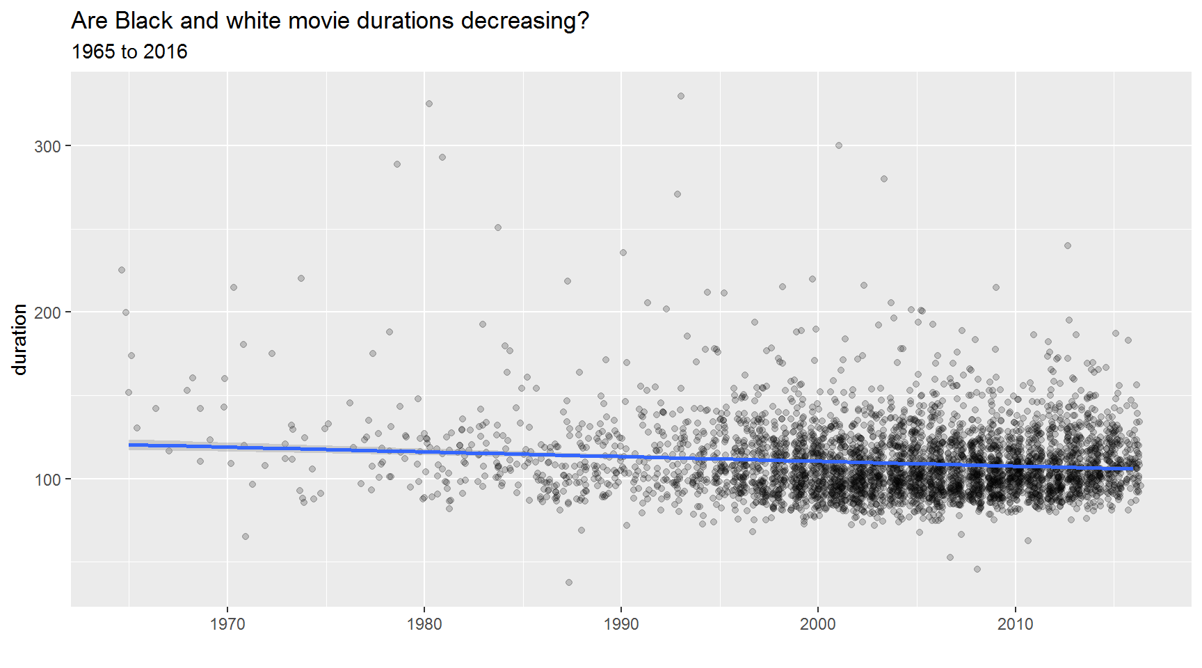
What about the duration of only black and white films?
Use a line plot to show the mean duration by year for Black and white films.
Hint: After filtering, create a summarized table grouped by title_year.
Hint 2: Set linetype = "dashed" inside geom_line(). 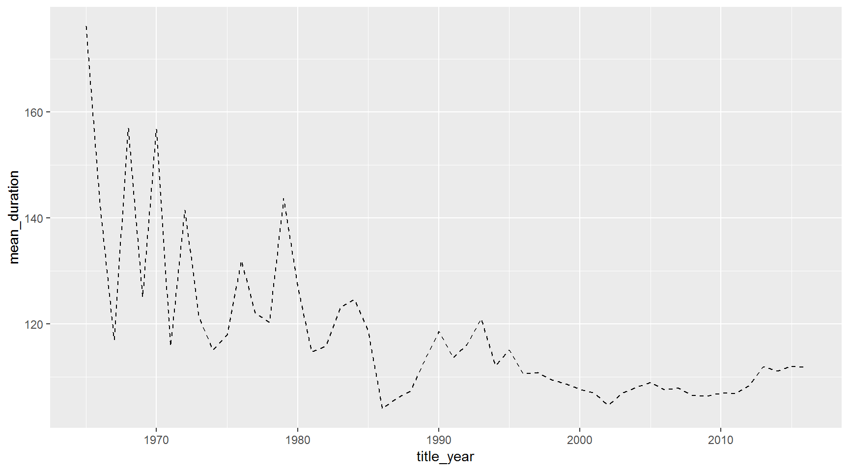
Since 1990, what was the average IMDB score for each content rating?
Hint: Summarize grouped by content_rating and title_year.
Hint 2: Use geom_tile(aes(fill = mean_score)).
filter(movies, title_year >= 1990) %>%
  group_by(content_rating, title_year) %>%
  summarize(mean_score = mean(imdb_score, na.rm = T)) %>%
  ggplot(aes(y = content_rating, x = title_year)) +
  geom_tile(aes(fill = mean_score), color = "white") +
  #theme_minimal() +
  labs(title = "Average IMDB score by content rating")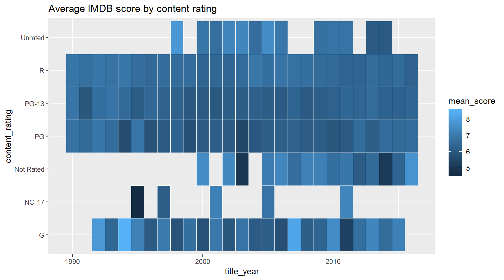
Show the distribution of gross for each content rating.
#install.packages("ggridges")
library(ggridges)

ggplot(movies, aes(x = gross_mil, y = content_rating, fill = content_rating)) + # x/y reveresed from boxplots
  geom_density_ridges() +
  scale_x_log10() +
  scale_fill_brewer() +
  labs(title = "Which rating makes more $$$ ?",
       x = "Gross in millions of dollars",
       y = "Content rating")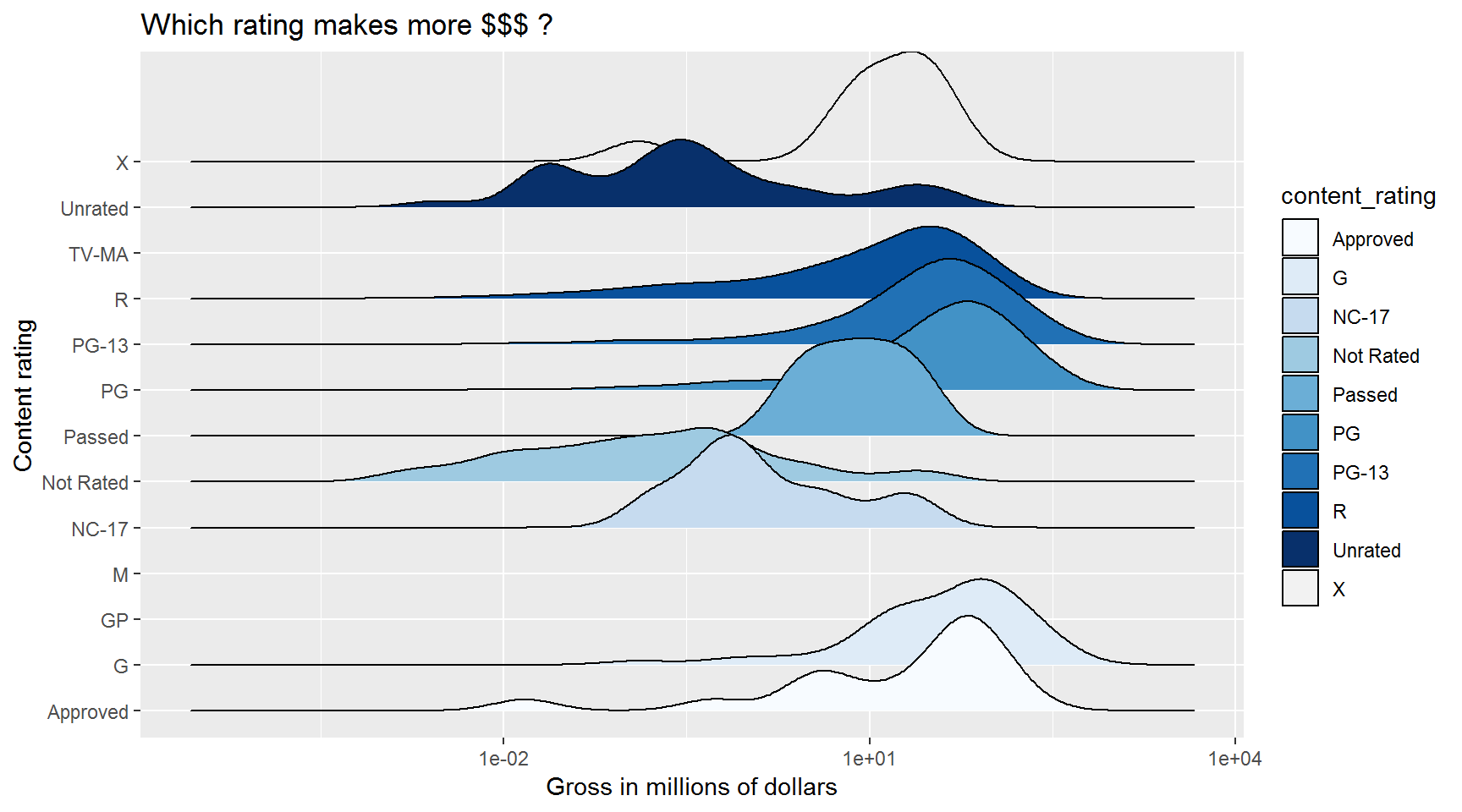
Save plots with ggsave()
After creating a ggplot in RStudio, save it to an image with
ggsave("Boxplot of movie ratings.png")Note: The default dimensions will match the plot viewer window in RStudio.
To set the size
# Widescreen plot for your TED talk
ggsave("Boxplot of movie ratings.png", width = 12, height = 4)
If you assigned your plot a name:
myplot <- ggplot(movies, aes(budget, gross)) + geom_point(aes(color = title_year))

ggsave(myplot, file = "Boxplot of movie ratings.png")

myplot
To save different formats change the file extension: pdf, jpg, png, tiff, eps, svg.
ggsave(myplot, file = "Boxplot of movie ratings.pdf")

ggsave(myplot, file = "Boxplot of movie ratings.jpg")
To double the size
ggsave(myplot, file = "Boxplot of movie ratings.png", scale = 2)To GADZOOGLE the font size! Use base_size =
myplot <- ggplot(movies, aes(budget, gross)) +
              geom_point(aes(color = title_year)) +
                  theme_gray(base_size = 40) +
                  labs(title = "BIG TITLE!")

ggsave(myplot, file = "Boxplot of movie ratings.png", scale = 2)

myplot
Rotate the X-axis labels
myplot <- ggplot(movies, aes(budget, gross)) +
              geom_point(aes(color = title_year)) +
                  theme_gray(base_size = 40) +
                  theme(axis.text.x = element_text(angle = 90, vjust = 0.5)) +
                  labs(title = "BIG TITLE!")

ggsave(myplot, file = "Boxplot of movie ratings.png", scale = 2)

myplot
Or shrink the labels
myplot <- ggplot(movies, aes(budget, gross)) +
              geom_point(aes(color = title_year)) +
                  theme_gray(base_size = 40) +
                  theme(axis.text.x = element_text(size = 20)) +
                  labs(title = "small TITLE!")

ggsave(myplot, file = "Boxplot of movie ratings.png", scale = 2)

myplot
Ref: http://stat545.com/
Frequent plotting questions
- How to modify the gridlines behind your chart?
- Try the different themes at the end of this lesson:
theme_light()ortheme_bw(). - Or modify the color and size with
theme(panel.grid.minor = element_line(colour = "white", size = 0.5)). - There’s even
theme_excel()
- Try the different themes at the end of this lesson:
- How do you set the x and y scale manually?
- Here is an example with a scatter plot:
ggplot() + geom_point() + xlim(beginning, end) + ylim(beginning, end) - Warning: Values above or below the limits you set will not be shown. This is another great way to lie with data.
- Here is an example with a scatter plot:
- How do you get rid of the legend if you don’t need it?
geom_point(aes(color = facility_name), show.legend = FALSE)- The R cookbook shows a number of ways to get rid of legends: http://www.cookbook-r.com/Graphs/Legends_(ggplot2)/
- I only like dashed lines. How do you change the linetype to a dashed line?
geom_line(aes(color = facility_name), linetype = "dashed")- You should also try
"dotted"and"dotdash", or maybe"twodash"if you really want to go wild. -How many colors are there in R? How did you knowhotpinkwas a color? - There is an R color cheatsheet: https://www.nceas.ucsb.edu/~frazier/RSpatialGuides/colorPaletteCheatsheet.pdf
- And some basic color names here: http://www.r-graph-gallery.com/42-colors-names/
- This web tool will give you palette ideas and color Hex numbers: http://colorbrewer2.org/#type=sequential&scheme=BuGn&n=3
color palettes()There are color palettes for your favorite movies, just fun palettes that you might likelibrary(viridis), color-blind palettes, and topography palettes.
- What are some handy keyboard shortcuts in R? How do I find them?
- There is a shortcut cheat sheet online here: https://www.rstudio.com/wp-content/uploads/2016/01/rstudio-IDE-cheatsheet.pdf
- Or go to Help > Keyboard Shortcuts Help
