R Training | Day 3
Welcome back Jedis!

Please connect to your droid
- Open the Start menu (Click the Windows logo on the bottom left of the screen)
- Select
Remote Desktop Connection - Enter
R32-your7digit#orw7-your7digit# - Press Connect
Open your RStudio project
- Open your project folder from last week
- Double click the .Rproj file to open RStudio
Open a New script
File > New File > R Script
- Click the floppy disk save icon
Give it a name:
03_day.Rorjakku_plots.Rwill work well
Schedule
- Review
- Where’s Finn?
- Join 2 tables
- Conditional mutate!
ifelse()- Yes/No decisions
- Summarize by group
- More plots
- New geoms
- Reference lines
- Faceting
- Colors
- Titles
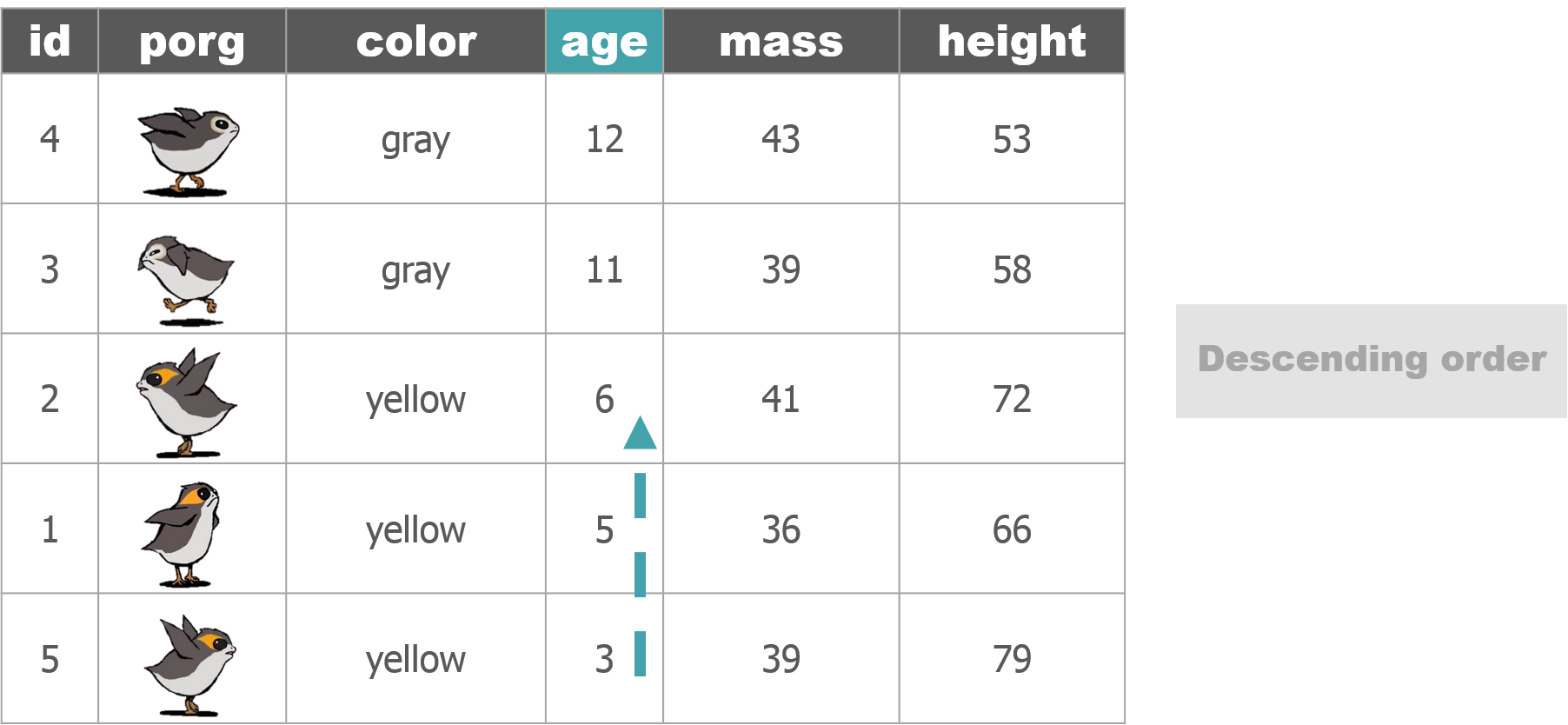
Porg review
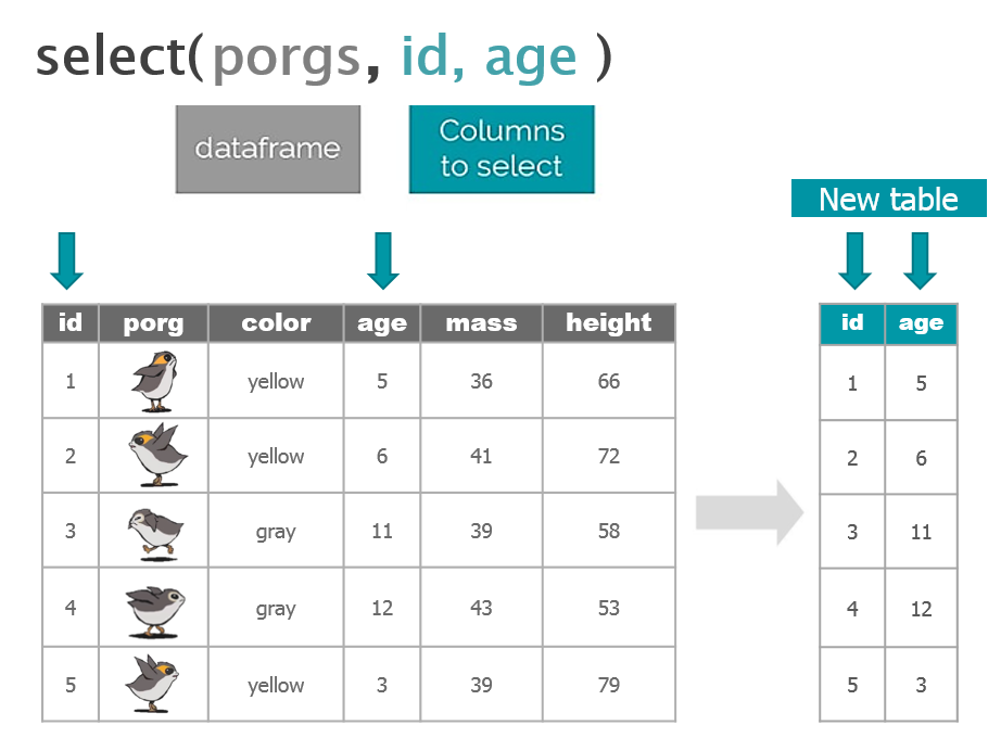
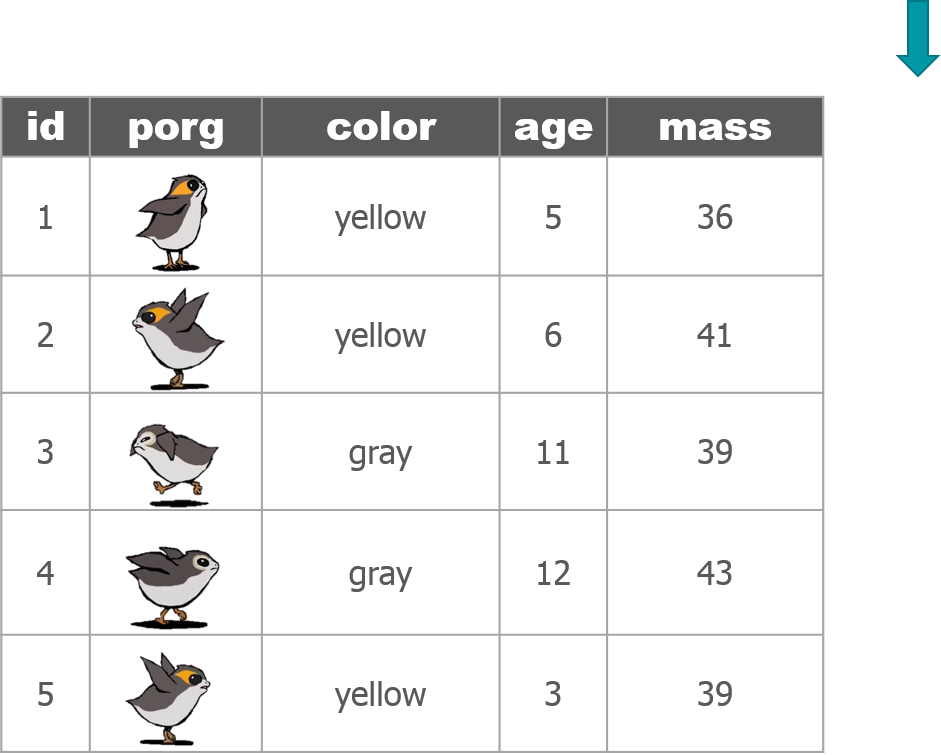
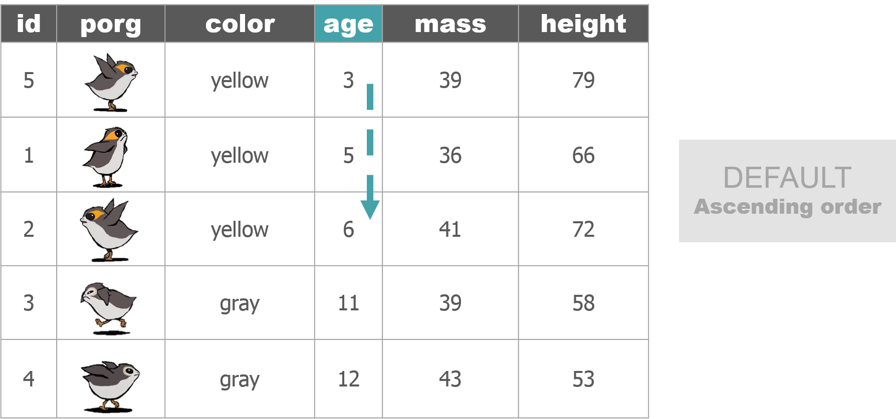
The poggle of porgs has returned to help us review the dplyr functions. Follow along by downloading the porg data from the URL below.
library(readr)
porgs <- read_csv("https://itep-r.netlify.com/data/porg_data.csv")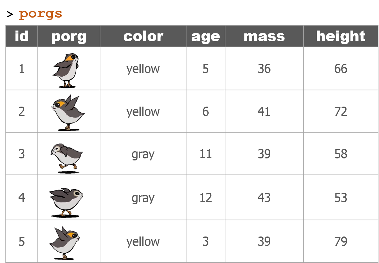


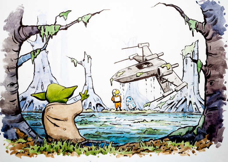
So where were we? Oh right, we we’re enjoying our time on beautiful lush Endor. But aren’t we missing somebody?
| Finn needs us!
That’s enough scuttlebutting around on Endor, Finn needs us back on Jakku. It turns out we forgot to pick-up Finn when we left. Now he’s being held ransom by Junk Boss Plutt. We’ll need to act fast to get to him before the Empire does. Blast off!

More data
Update from BB8!
BB8 was busy on our flight back to Jakku, and was able to recover a full set of scrap records from the notorious Unkar Plutt. Let’s take a look.
library(readr)
library(dplyr)

# Read in the full scrap database
scrap <- read_csv("https://itep-r.netlify.com/data/starwars_scrap_jakku_full.csv")
1 | Jakku re-visited
Okay, so we’re back on the ol’ dust bucket. Let’s try not to forget anything while were here this time. We’re quickly running out of friends on this planet.
A scrappy ransom
Mr. Baddy Plutt is demanding 10,000 items of scrap for Finn. Sounds expensive, but lucky for us he didn’t clarify the exact items. Let’s find the scrap that weighs the least per shipment and try to make this transaction as light as possible.
Take a look at our NEW scrap data and see if we have the weight of all the items.
# What unit types are in the data?
unique(scrap$units)
## [1] "Cubic Yards" "Items" "Tons"Or return results as a data frame
distinct(scrap, units)## # A tibble: 3 x 1
## units
## <chr>
## 1 Cubic Yards
## 2 Items
## 3 TonsHmmm…. So how much does a cubic yard of Hull Panel weigh?
A lot? 32? Maybe…
I think we’re going to need some more data.
“Hey BB8!”
“Please do your magic data finding thing.”
Get the weights

It took a while, but with a few droid bribes BB8 was able to track down a Weight conversion table from his old droid buddies. Our current data shows the total cubic yards for some scrap shipments, but not how much the shipment weighs.
Read the weight conversion table
# The data's URL
convert_url <- "https://rtrain.netlify.com/data/conversion_table.csv"

# Read the conversion data
convert <- read_csv(convert_url)

head(convert, 3)
## # A tibble: 3 x 3
## item units pounds_per_unit
## <chr> <chr> <dbl>
## 1 Bulkhead Cubic Yards 321
## 2 Hull Panel Cubic Yards 641
## 3 Repulsorlift array Cubic Yards 467Stars! A cubic yard of Hull Panel weighs 641 lbs. That’s what I thought!
Let’s join this new conversion table to the scrap data to make our calculations easier. To do that we need to make a new friend.
Say “Hello” to left_join()!
2 | Join tables
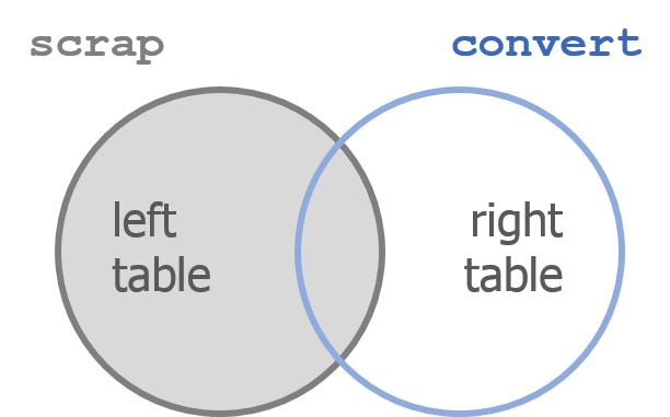
left_join() works like a zipper and combines two tables based on one or more variables. It’s called “left”-join because the entire table on the left side is retained. Anything that matches from the right table gets to join the party, but the rest will be ignored.
Join 2 tables
left_join(table1, table2, by = c("columns to join by"))
Adding porg names
Remember our porg friends? How rude of us not to share their names. Wups!
Here they are:
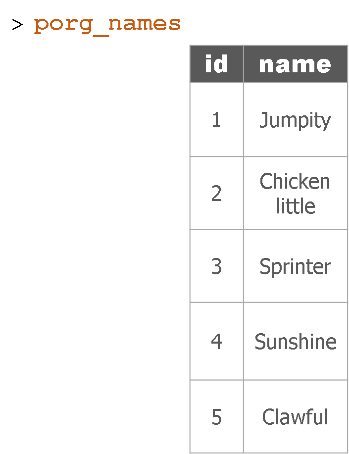
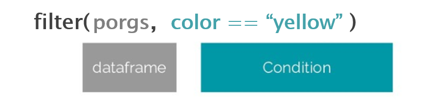
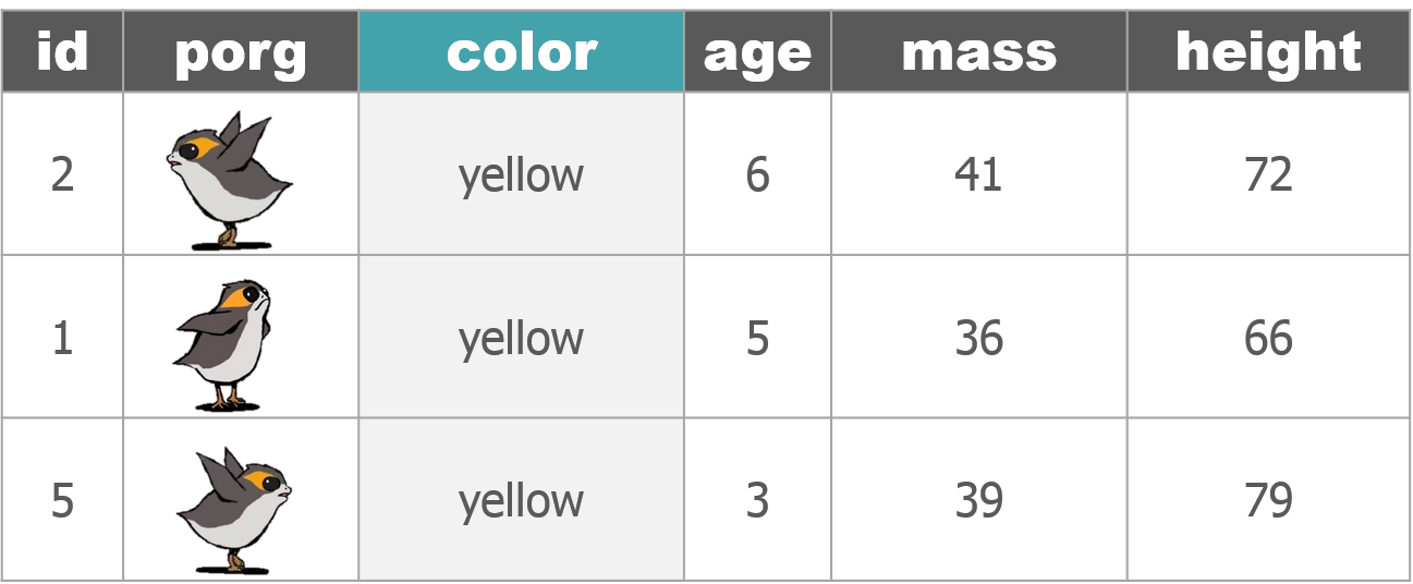
Hey now! That’s not very helpful. Who’s who? Let’s join their names to the rest their data.
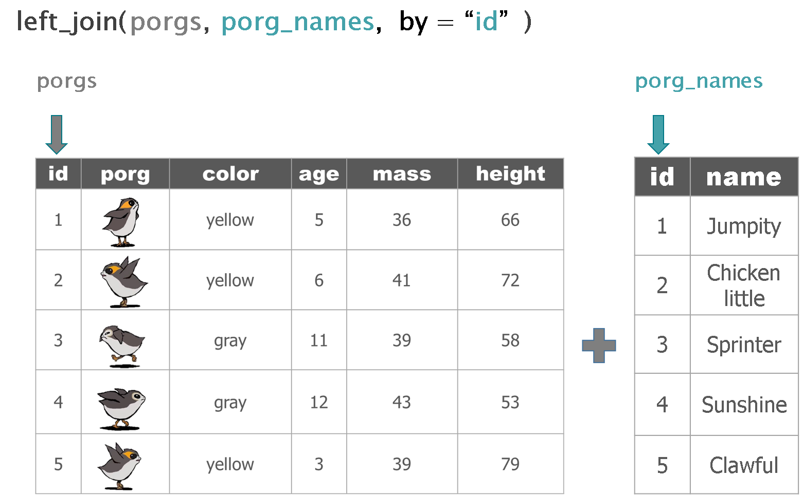
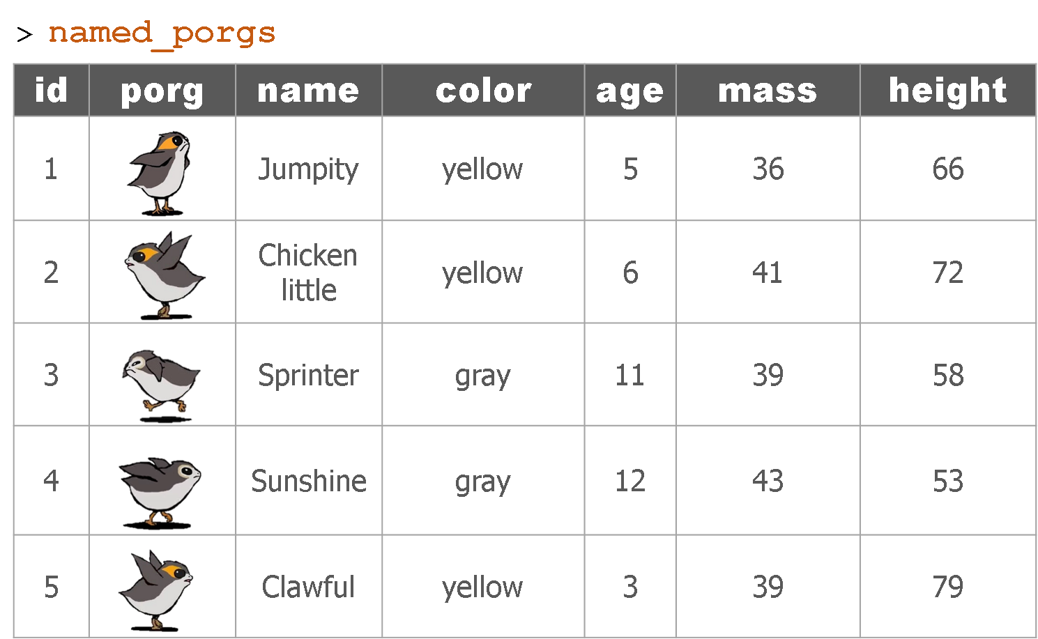
The result
Back to scrap land
Let’s apply our new left_join() skills to the scrap data.
Join the conversion table to the scrap
Look at the tables. What columns in both tables do we want to join by?
scrap <- left_join(scrap, convert,
                   by = c("item" = "item", "units" = "units"))
Want to skimp on typing?
When the 2 tables share column names that are the same, left_join() will automatically search for matching columns. Nice! So the code below does the same as above.
scrap <- left_join(scrap, convert)

head(scrap, 4)
## # A tibble: 4 x 8
## receipt_date item origin destination amount units price_per_pound
## <chr> <chr> <chr> <chr> <dbl> <chr> <dbl>
## 1 4/1/2013 Bulk~ Crate~ Raiders 4017 Cubi~ 1005.
## 2 4/2/2013 Star~ Outsk~ Trade cara~ 1249 Cubi~ 1129.
## 3 4/3/2013 Star~ Outsk~ Niima Outp~ 4434 Cubi~ 1129.
## 4 4/4/2013 Hull~ Crate~ Raiders 286 Cubi~ 843.
## # ... with 1 more variable: pounds_per_unit <dbl>Want more details?
You can type ?left_join to see all the arguments and options.
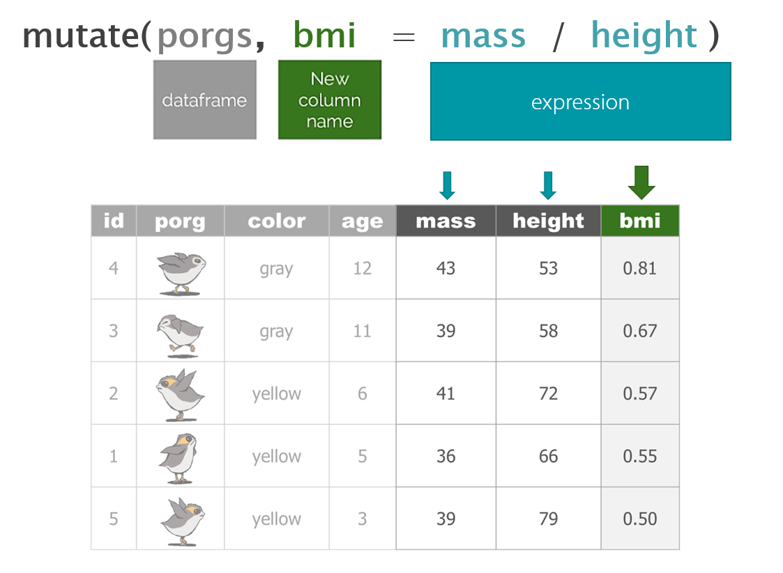
Total pounds per shipment
Let’s mutate!
Now that we have pounds per unit we can use mutate to calculate the total pounds for each shipment.
Fill in the blank
scrap <- scrap %>%
         mutate(total_pounds = amount *  _____________ )
Show code
scrap <- scrap %>%
         mutate(total_pounds = amount * pounds_per_unit)
Total price per shipment
EXERCISE
Total price
We need to do some serious multiplication. We now have the total amount shipped in pounds, and the price per pound, but we want to know the total price for each transaction.
How do we calculate that?
# Calculate the total price for each shipment
scrap <- scrap %>%
         mutate(credits = ________ * ________ )
Total price
We need to do some serious multiplication. We now have the total amount shipped in pounds, and the price per pound, but we want to know the total price for each transaction.
How do we calculate that?
# Calculate the total price for each shipment
scrap <- scrap %>%
         mutate(credits = total_pounds  * ________ )
Total price
We need to do some serious multiplication. We now have the total amount shipped in pounds, and the price per pound, but we want to know the total price for each transaction.
How do we calculate that?
# Calculate the total price for each shipment
scrap <- scrap %>%
         mutate(credits = total_pounds * price_per_pound)
Price per item
Great! Let’s add one last column. We can divide the shipment’s credits by the amount of items to get the price_per_unit.
# Calculate the price per unit
scrap <- scrap %>%
         mutate(price_per_unit = credits / amount)
Data analysts often get asked summary questions such as:
- What’s the highest or worst?
- What’s the lowest number?
- Is that worse than average?
- What’s the average tonnage of scrap from Cratertown this year?
- What city is making the most money?
On to summarize()!
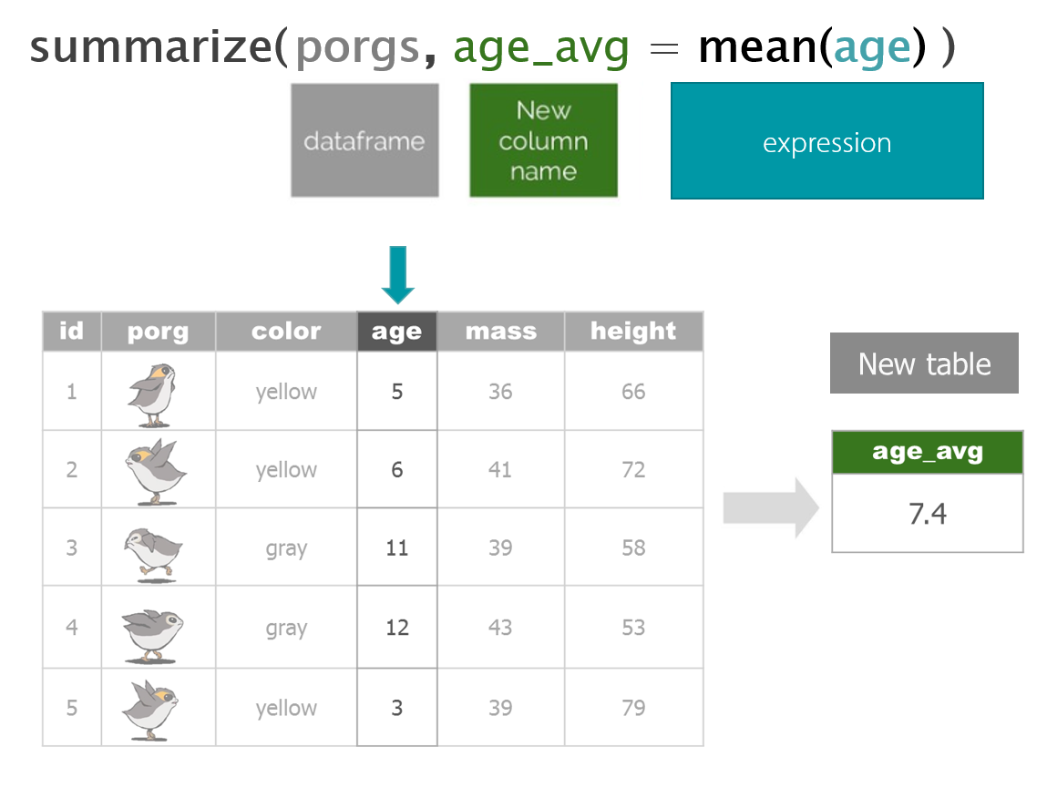
3 | summarize() this!
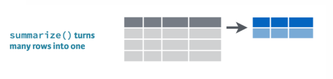
summarize() allows you to apply a summary function like median() to a column and collapse your data down to a single row. To really dig into summarize you’ll want to know some common summary functions, such as sum(), mean(), median(), min(), and max().
sum()
Use summarize() and sum() to find the total credits of all the scrap.
summarize(scrap, total_credits = sum(credits))mean()
Use summarize() and mean() to calculate the mean price_per_pound in the scrap report.
summarize(scrap, mean_price = mean(price_per_pound, na.rm = T))Note the
na.rm = TRUEin themean()function. This tells R to ignore empty cells or missing values that show up in R asNA. If you leavena.rmout, the mean function will return ‘NA’ if it finds a missing value in the data.
median()
Use summarize to calculate the median price_per_pound in the scrap report.
summarize(scrap, median_price = median(price_per_pound, na.rm = T))max()
Use summarize to calculate the maximum price per pound any scrapper got for their scrap.
summarize(scrap, max_price = max(price_per_pound, na.rm = T))min()
Use summarize to calculate the minimum price per pound any scrapper got for their scrap.
summarize(scrap, min_price = min(price_per_pound, na.rm = T))nth()
Use summarize() and nth(Origin, 12) to find the name of the Origin City that had the 12th highest scrapper haul.
Hint: Use arrange() first.
arrange(scrap, desc(credits)) %>% summarize(price_12 = nth(origin, 12))quantile()
Quantiles are great for finding the upper or lower range of a column. Use the quantile() function to find the the 5th and 95th quantile of the prices.
summarize(scrap,
          price_5th_pctile  = quantile(price_per_pound, 0.05, na.rm = T),
          price_95th_pctile = quantile(price_per_pound, 0.95))
Hint: Add na.rm = T to quantile().
EXERCISE
Create a summary of the scrap data that includes 3 of the summary functions above. The following is one example.
summary <- scrap %>%
             summarize(max_credits      =  __________ ,
                       mean_credits     =  __________ ,
                       min_pounds       =  __________  )
n()
n() stands for count. It has the smallest function name I know of, but is super useful.
Use summarize and n() to count the number of reported scrap records going to Niima outpost.
Hint: Use filter() first.
niima_scrap <- filter(scrap, destination == "Niima Outpost") niima_scrap <- summarize(niima_scrap, scrap_records = n())Ok. That was fun. Now let’s do a summary for Cratertown. And then for Blowback Town. And then for Tuanul. And then for…
Wait!
Do we really need to
filterto the origin city that we’re interested in every single time?How about you just give me the mean price for every origin city. Then I could use that to answer a question about any city I want.
Okay. Fine. It’s time we talk about
group_by().
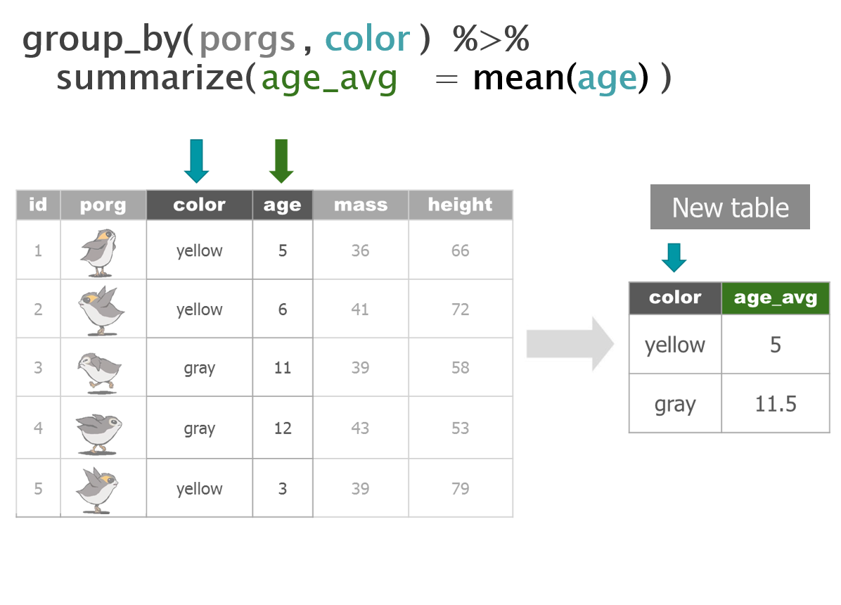
4 | group_by()
4.1 The junk Capital of Jakku
Which origin city had the most shipments of junk?
Use group_by with the column origin, and then usesummarize to count the number of records at each origin city.
Fill in the blank
scrap_shipments <- group_by(scrap, ______ ) %>%
                     summarize(shipments =  ______ )
Show code
scrap_shipments <- group_by(scrap, origin ) %>%
                     summarize(shipments =  n() )
Pop Quiz!
Which city had the most scrap shipments?
Tuanul
Outskirts
Reestki
Cratertown
Show solution
Cratertown
You’ve got the POWER!
Bargain hunters
Who’s selling goods for cheap?
Use group_by with the column origin, and then usesummarize to find the mean(price_per_unit) at each origin city.
Show code
mean_prices <- group_by(scrap, origin) %>%
                 summarize(mean_price = mean(price_per_unit, na.rm = T)) %>%
                 ungroup()
EXPLORE: Rounding digits
You can round the prices to a certain number of digits using the round() function. We can finish by adding the arrange() function to sort the table by our new column.
mean_prices <- group_by(scrap, origin) %>%
                 summarize(mean_price       = mean(price_per_unit, na.rm = T),
                           mean_price_round = round(mean_price, digits = 2)) %>%
                 arrange(mean_price_round) %>%
                 ungroup()
Special note
The round() function in R does not automatically round values ending in 5 up. Instead it uses scientific rounding, which rounds values ending in 5 to the nearest even number. So 2.5 rounded to the nearest whole number rounds down to 2, and 3.5 rounded to the nearest whole number rounds up 4.
Pro-tip!
Ending with ungroup() is good practice. This prevents your data from staying grouped after the summarizing has been completed.
5 | Save files
Let’s save the mean price summary table we created to a CSV. That way we can transfer it to a droid courier for delivery to Rey. To save a data frame we use the write_csv() function from our favorite readr package.
# Write the file to your results folder
write_csv(mean_prices, "results/prices_by_origin.csv")
WARNING!
By default, when saving files R will overwrite a file if the file already exists in the same folder. It will not ask for confirmation. To be safe, save processed data to a new folder called results/ and not to your raw data/ folder.
6 | ifelse()
[If this thing is true], "Do this", "Otherwise do this"

Here’s a handy ifelse statement to help you identify lightsabers.
ifelse(Is lightsaber GREEN?, Yes! Then it's Yoda's, No! Then it's not Yoda's)
Say you want to label all the porgs over 60 cm as tall, and everyone else as short. In other words, we want to add a column where the value depends on the value found in the height column. We use ifelse() for this.
Or maybe you have a list of prices for scrap, and you want to flag only the ones that cost less than 500 credits.
mutate() + ifelse() is powerful!
On the cheap
Bad news. We’re on a budget people. Rey can’t afford anything over 500 credits per item.
Let’s add a column that labels the items as “Cheap” if the price is less than 500.
Add an affordable column
library(dplyr)
library(readr)

# Add an affordable column
scrap <- scrap %>%
         mutate(affordable = ifelse(price_per_unit < 500, "Cheap", "Expensive"))
EXERCISE
Use filter() to create a new cheap_scrap table.
Pop Quiz!
What is the cheapest item?
Black box
Electrotelescope
Atomic drive
Enviro filter
Main drive
Show solution
Black box
You win!
CONGRATULATIONS of galactic proportions to you.
We now have a clean and tidy data set. If BB8 receives new data to append, we can re-run this script and in 5 seconds we’ll have cleaned up data again!
7 | Plots with ggplot2
Plot the data, Plot the data, Plot the data

The ggplot() sandwich

A ggplot has 3 ingredients.
1. The base plot
library(ggplot2)ggplot(scrap)
Note when we load the package it’s
library (ggplot2), but the function to make a plot isggplot(scrap). We admit, it is a bit silly.
2. The the X, Y aesthetics
The aesthetics assign the components from the data that you want to use in the chart. These also determine the dimensions of the plot.
ggplot(scrap, aes(x = origin, y = credits)) 
3. The layers or geometries
ggplot(scrap, aes(x = origin, y = credits)) + geom_point()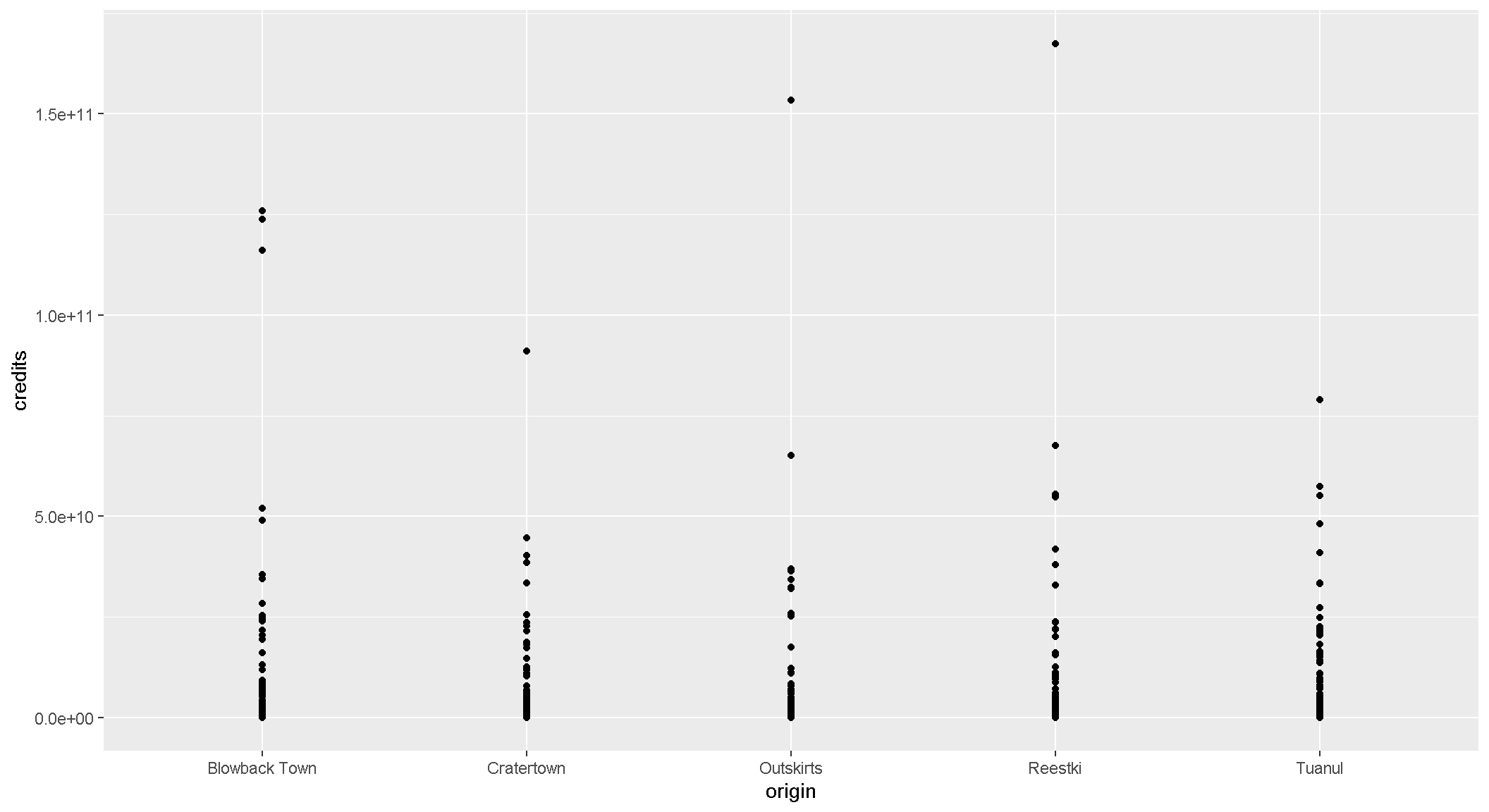
EXERCISE
Try making a scatterplot of any two columns.
Hint: Numeric variables will be more informative.
ggplot(scrap, aes(x = __column1__, y = __column2__)) + geom_point()Colors
Now let’s use color to show the destination of the scrap
ggplot(scrap, aes(x = origin, y = credits, color = destination)) +
  geom_point()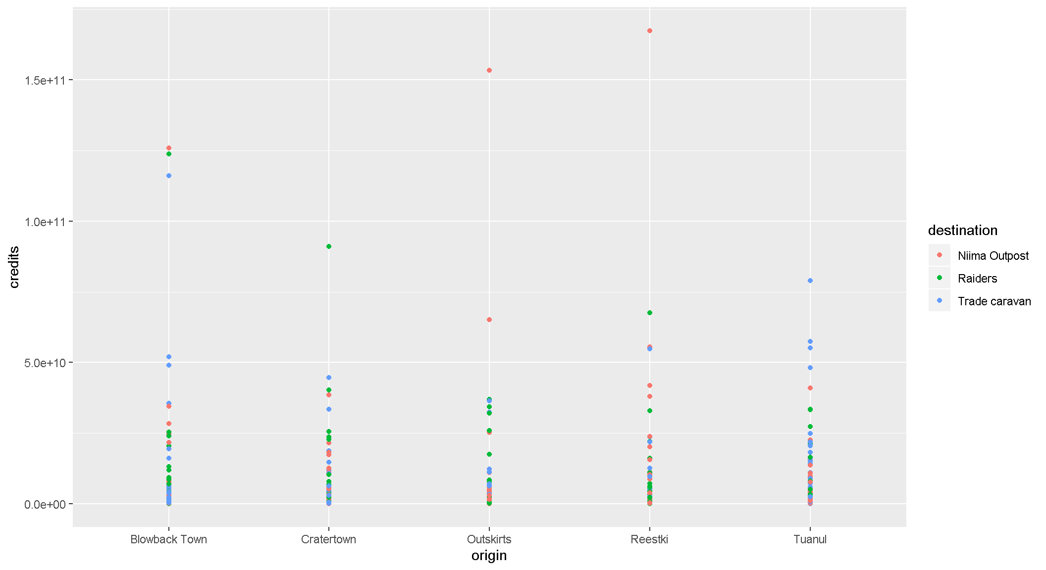
Columns charts
Yikes! That point chart had too much detail. Let’s make a column chart and add up the sales to make it easier to understand. Note that we used fill = instead of color =. Try using color instead and see what happens.
ggplot(scrap, aes(x = origin, y = credits, fill = destination)) +
  geom_col()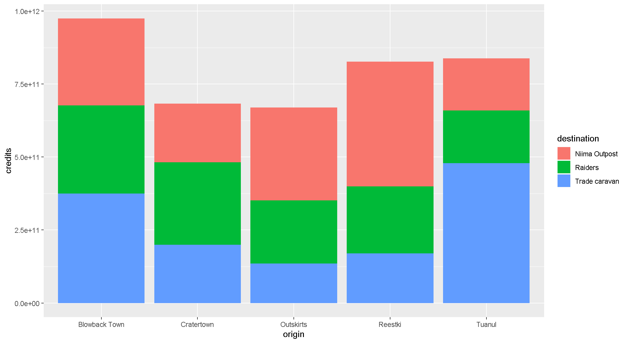
We can change the position of the bars to make it easier to compare sales by destination for each origin. For that we’ll use the – drum roll please – position argument. Remember, you can use help(geom_col) to learn about the different options for that type of plot.
ggplot(scrap, aes(x = origin, y = credits, fill = destination)) +
  geom_col(position = "dodge")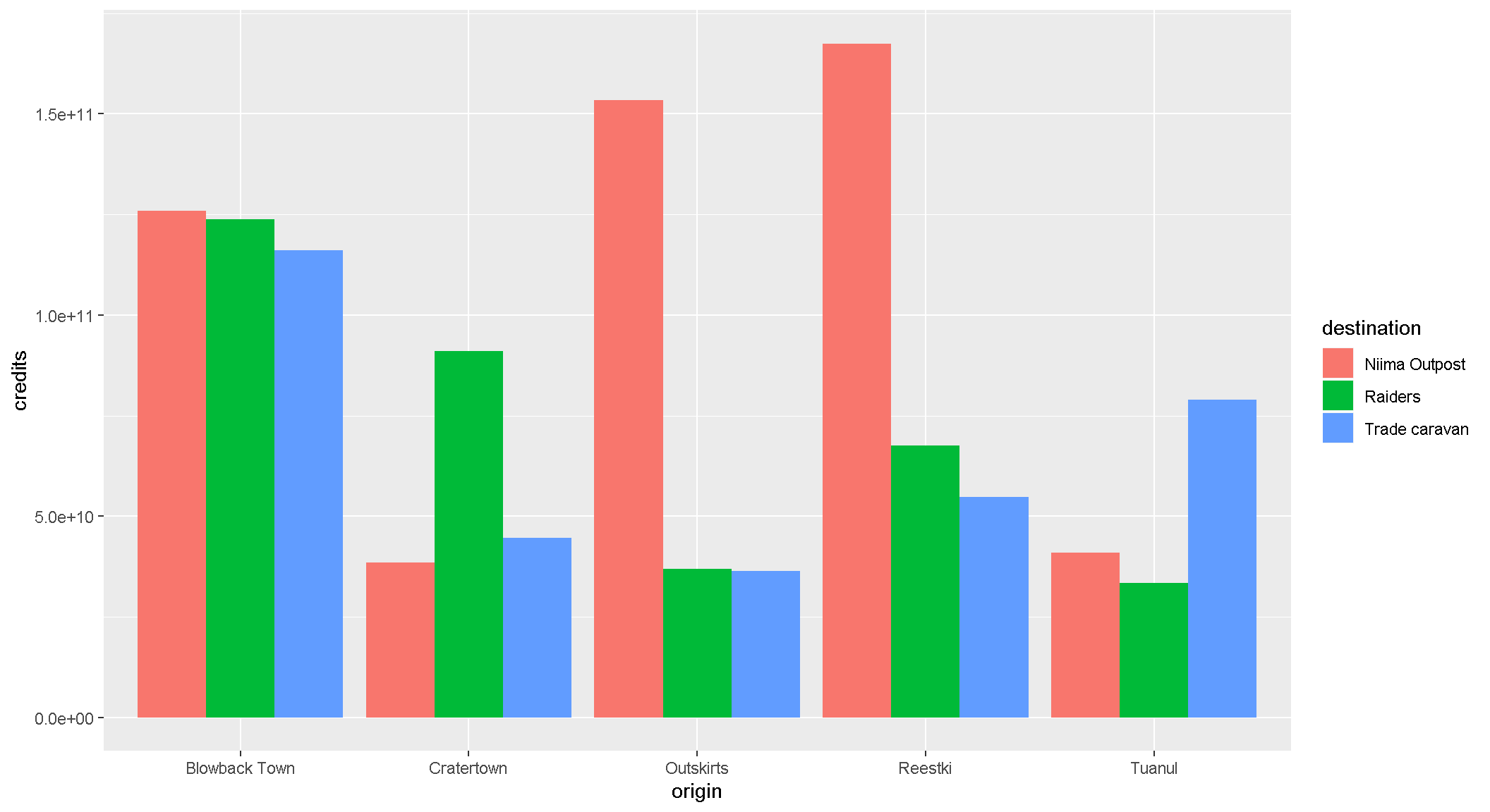
EXERCISE
An easy way to experiment with colors is to add layers like + scale_fill_viridis() or + scale_fill_brewer() to your plot, which will link to RcolorBrewer so you can have accessible color schemes.
Try adding one of thse to your column plot above.
Facet wrap
Does the chart feel crowded to you? Let’s use facet wrap to put each origin in a separate chart.
ggplot(scrap, aes(x = origin, y = credits, fill = destination)) +
  geom_col(position = "dodge") +
  facet_wrap("destination")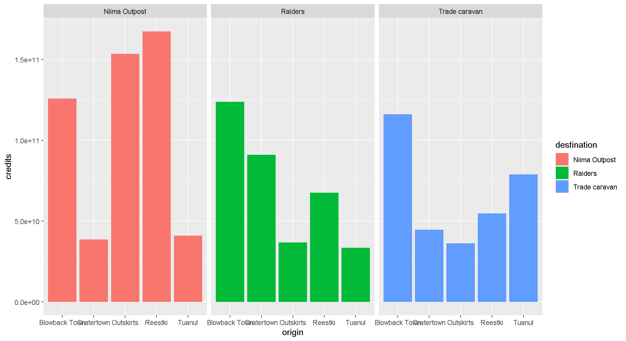
8 It’s Finn time
Seriously. Let’s pay that ransom already.
Where should we go to get our 10,000 Black boxes?
Step 1: Filter the scrap data to only Black box.
cheap_scrap <- filter(scrap, ______ == _____ )Step 2: Make a geom_col() plot of the total pounds of Black boxes shipped to each destination.
ggplot(cheap_scrap, aes(x =   , y =    ) ) +
   geom_
Show code
ggplot(cheap_scrap, aes(x = destination, y = total_pounds) ) +
   geom_col()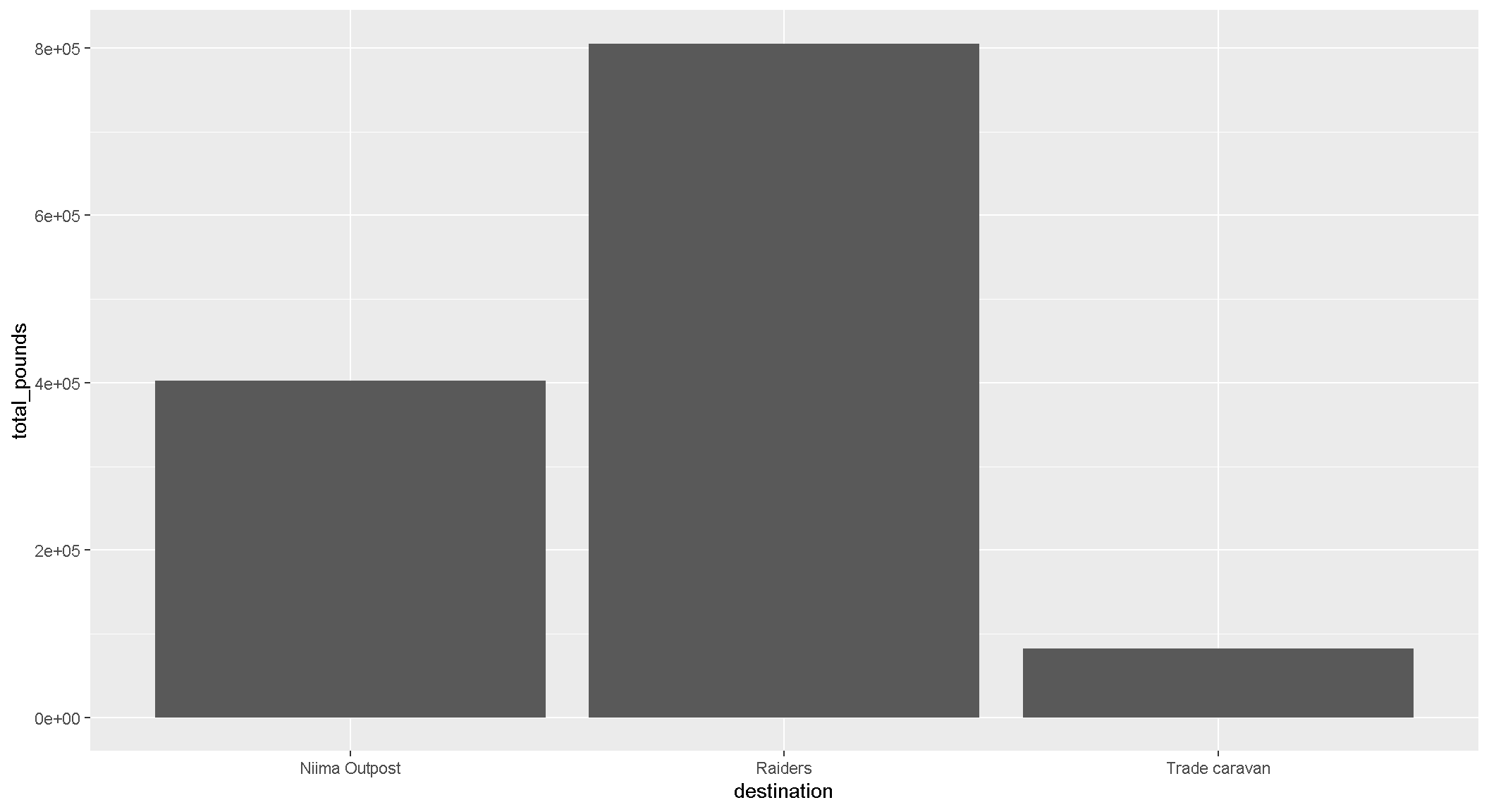
Pop Quiz!
Which destination has the most pounds of the cheapest item?
Trade caravan
Niima Outpost
Raiders
Show solution
Raiders
Woop! Go get em! So long Jakku - see you never!
CONCATULATIONS!
Clap your hands. You have earned a great award.
9 | Plot extras
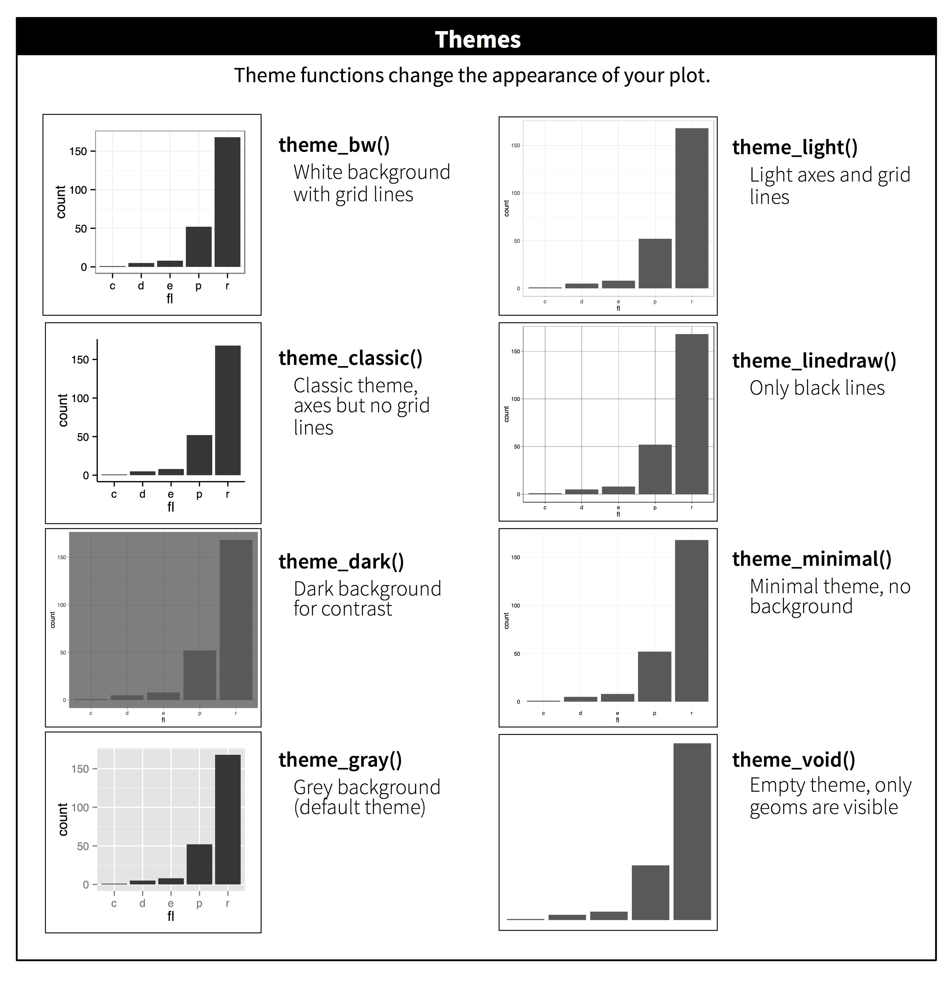
Themes
Want to shake up the appearance of your plots? ggplot2 uses theme functions to change the general appearance of a plot. Try some different themes out. Here’s theme_dark().
ggplot(scrap, aes(x = origin, y = credits, fill = destination)) +
  geom_col(position = "dodge") +
  facet_wrap("destination") +
  theme_dark()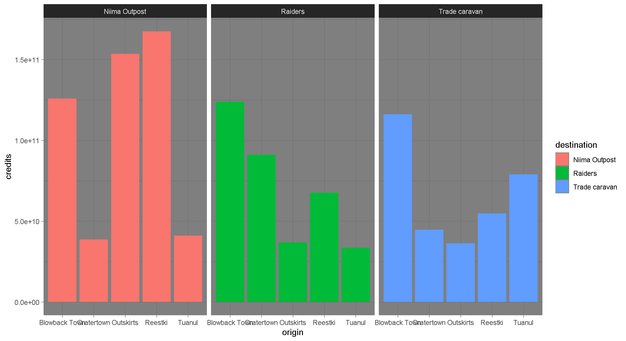
Labels
You can set the axis and title labels using the labs function.
ggplot(scrap, aes(x = origin, y = credits, fill = destination)) +
  geom_col(position = "dodge") +
  facet_wrap("destination") +
  labs(title    = "Scrap sales by origin and destination",
       subtitle = "Planet Jakku",
       x        = "Origin",
       y        = "Total sales",
       caption  = "Data gracefully provided by BB8")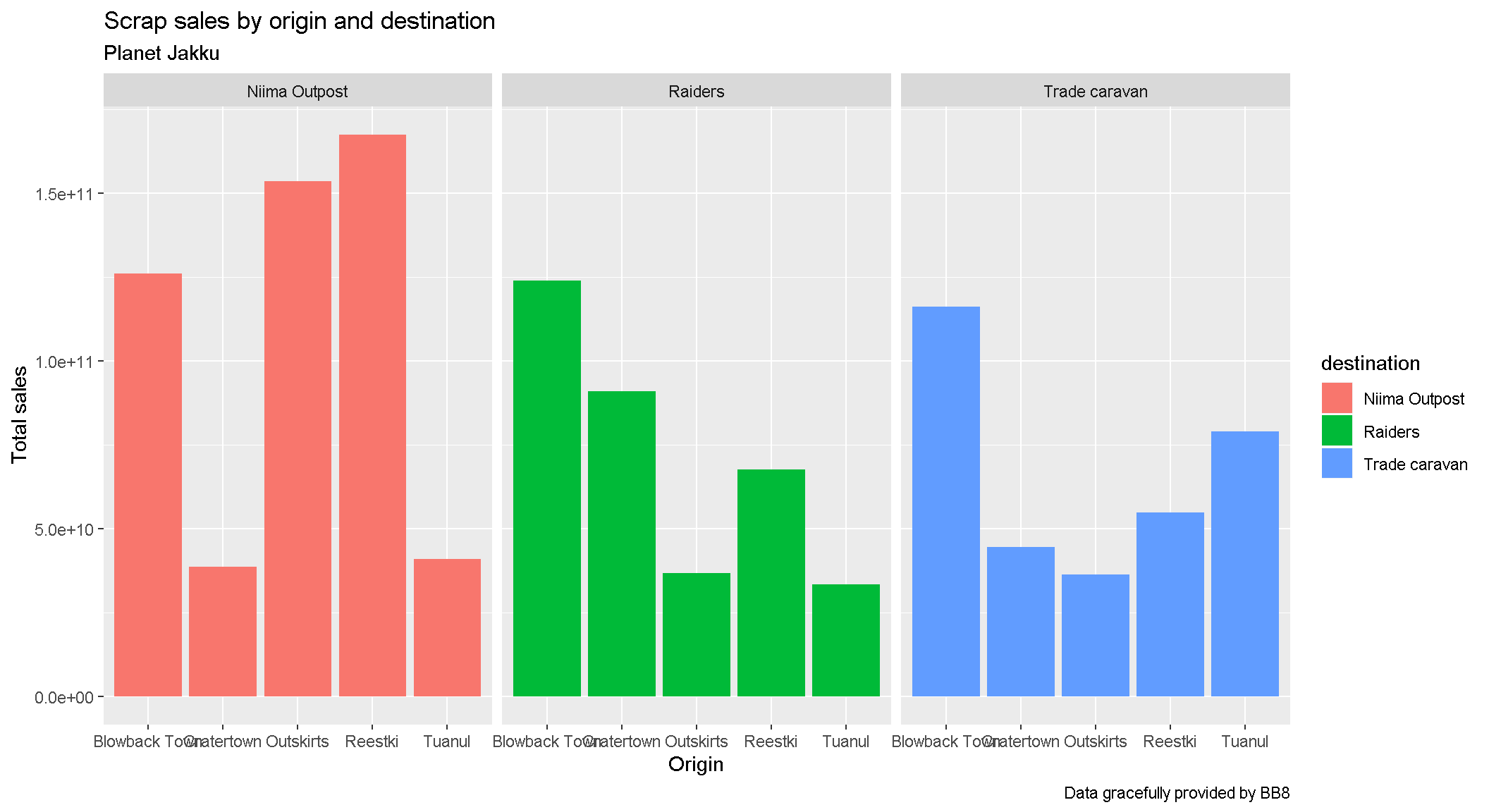
Drop 1.0e+10 scientific notation
Is your boss scared of scientific notation? To hide it we can use options(scipen = 999). Note that this is a general setting in R. Once you use options(scipen = 999) in your current session you won’t have to use it again. Like loading a package, you only need to run the line once when you start RStudio.
options(scipen = 999)

ggplot(scrap, aes(x = origin, y = credits, fill = destination)) +
  geom_col(position = "dodge") +
  facet_wrap("destination") +
  theme_bw() +
  labs(title = "Scrap sales by origin and destination",
       x     = "Origin",
       y     = "Total sales")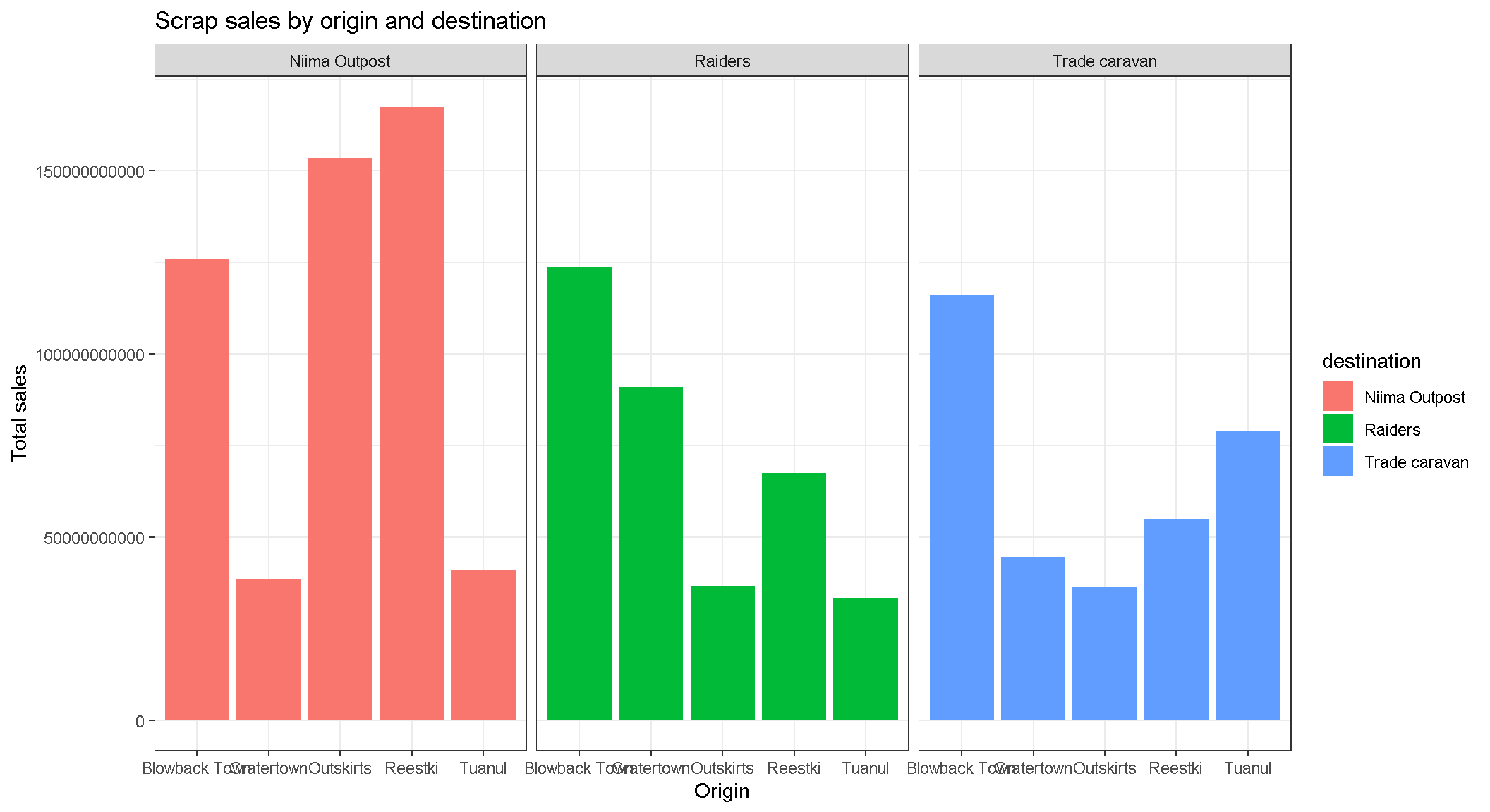
CHALLENGE
Let’s say we don’t like printing so many zeros and want the labels to be in Millions of credits. How can you make it happen?
[Click here for a HINT]
Sorry, the hint is missing. You’re on your own.
EXERCISE
Be brave and make a boxplot. We’ve covered how to do a scatterplot with geom_point and a bar chart with geom_col, but how would you make a boxplot showing the prices at each destination? You’re on your own here. Feel free to add color ,facet_wrap, theme, and labs to your boxplots.
May the force be with you.
Save plots
You’ve hopefully made some plots you’re proud of, so let’s learn to save them so we can cherish them forever. There’s a function called ggsave to do just that. How do we ggsave our plots? HELP! Let’s type help(ggsave).
# Get help
help(ggsave)
?ggsave

# Copy and paste the r code of your favorite plot here
ggplot(data, aes()) +
   .... +
   ....


# Save your plot to a png file of your choosing
ggsave("your_results_folder/plot_name.png")
Pro-tip!
Sometimes you may want to make a plot and save it for later. For that, you give your plot a name. Any name will do.
# The ggplot you want to save
my_plot <- ggplot(...)

# The name of the file the chart will be saved to.
where_to_save_it <- "___.png"

# Save it!
ggsave(filename = where_to_save_it, plot = my_plot)
Learn more about saving plots at http://stat545.com/
10 | Glossary
Table of aesthetics
| aes() |
|---|
x = |
y = |
alpha = |
fill = |
color = |
size = |
linetype = |
Table of geoms
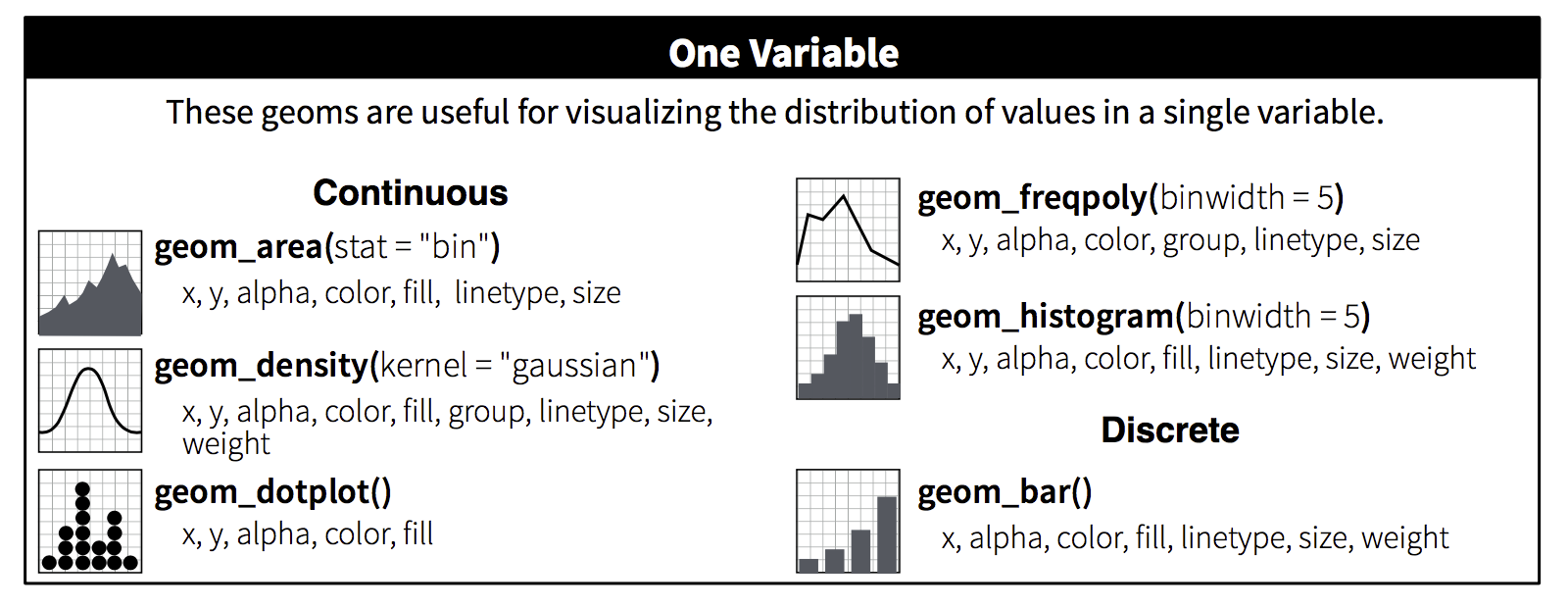
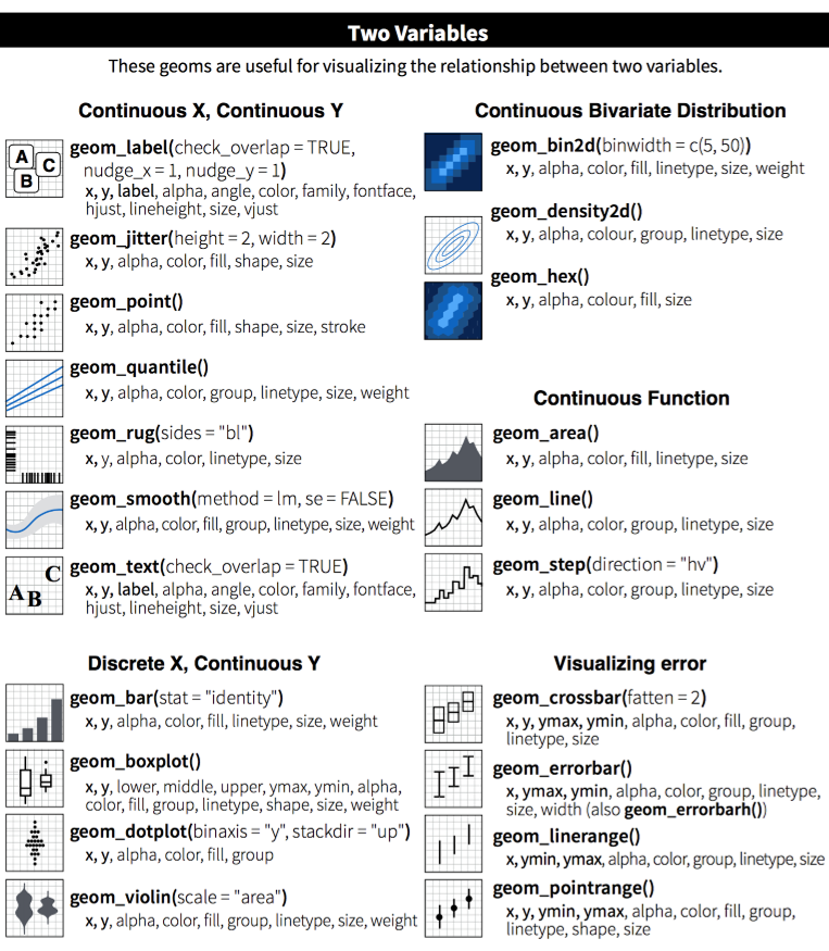
Table of themes
You can customize the look of your plot by adding a theme() function.
Homeworld training

- Load one of the data sets below into R
- Porg contamination on Ahch-To
https://rtrain.netlify.com/data/porg_samples.csv
- Planet Endor air samples
https://rtrain.netlify.com/data/air_endor.csv
- Or use data from a recent project of yours
- Porg contamination on Ahch-To
Create 2 plots using the data.
If you make something really strange. Feel free to share! Consider it art and keep going.
Pro-tip!
When you add more layers using + remember to place it at the end of each line.
# This will work
ggplot(scrap, aes(x = origin, y = credits)) +
  geom_point()

# So will this
ggplot(scrap, aes(x = origin, y = credits)) + geom_point()

# But this won't
ggplot(scrap, aes(x = origin, y = credits))
  + geom_point()
Plots Q+A
- How to modify the gridlines behind your chart?
- Try the different themes at the end of this lesson:
theme_light()ortheme_bw() - Or modify the color and size with
theme(panel.grid.minor = element_line(colour = "white", size = 0.5)) - There’s even
theme_excel()
- Try the different themes at the end of this lesson:
- How do you set the x and y scale manually?
- Here is an example with a scatter plot:
ggplot() + geom_point() + xlim(beginning, end) + ylim(beginning, end) - Warning: Values above or below the limits you set will not be shown. This is another great way to lie with data.
- Here is an example with a scatter plot:
- How do you get rid of the legend if you don’t need it?
geom_point(aes(color = facility_name), show.legend = FALSE)- The R Cookbook shows a number of ways to get rid of legends.
- I only like dashed lines. How do you change the linetype to a dashed line?
geom_line(aes(color = facility_name), linetype = "dashed")- You can also try
"dotted"and"dotdash", or even"twodash"
- How many colors are there in R? How does R know
hotpinkis a color?- There is an R color cheatsheet
- As well as a list of R color names
library(viridis)provides some great default color palettes for charts and maps.- This Color web tool has palette ideas and color codes you can use in your plots
- There is an R color cheatsheet
- Keyboard shortcuts for RStudio
- There is a Shortcut cheatsheet
- In RStudio you can go to Help > Keyboard Shortcuts Help